
Roles: Illustrator, Brand Identity, Product Design, Environmental Design
Time Frame: 8 weeks
Tools: Illustrator, InDesign, Photoshop
Overview: Timber! is a family-friendly, three-day outdoor music festival set in a densely forested park at the confluence of two rivers. The festival uniquely blends indie rock, folk, and pop performances with camping and outdoor experiences, including hiking, swimming, yoga, and hands-on craft activities.
Challenge: Timber has maintained the same visual identity for over a decade. While the branding is recognizable, its Southwestern color palette and Memphis-inspired design do not reflect the event's atmosphere and experience. My goal was to refresh the festival’s visual identity and design materials to better capture the spirit of Timber! while attracting new audiences.
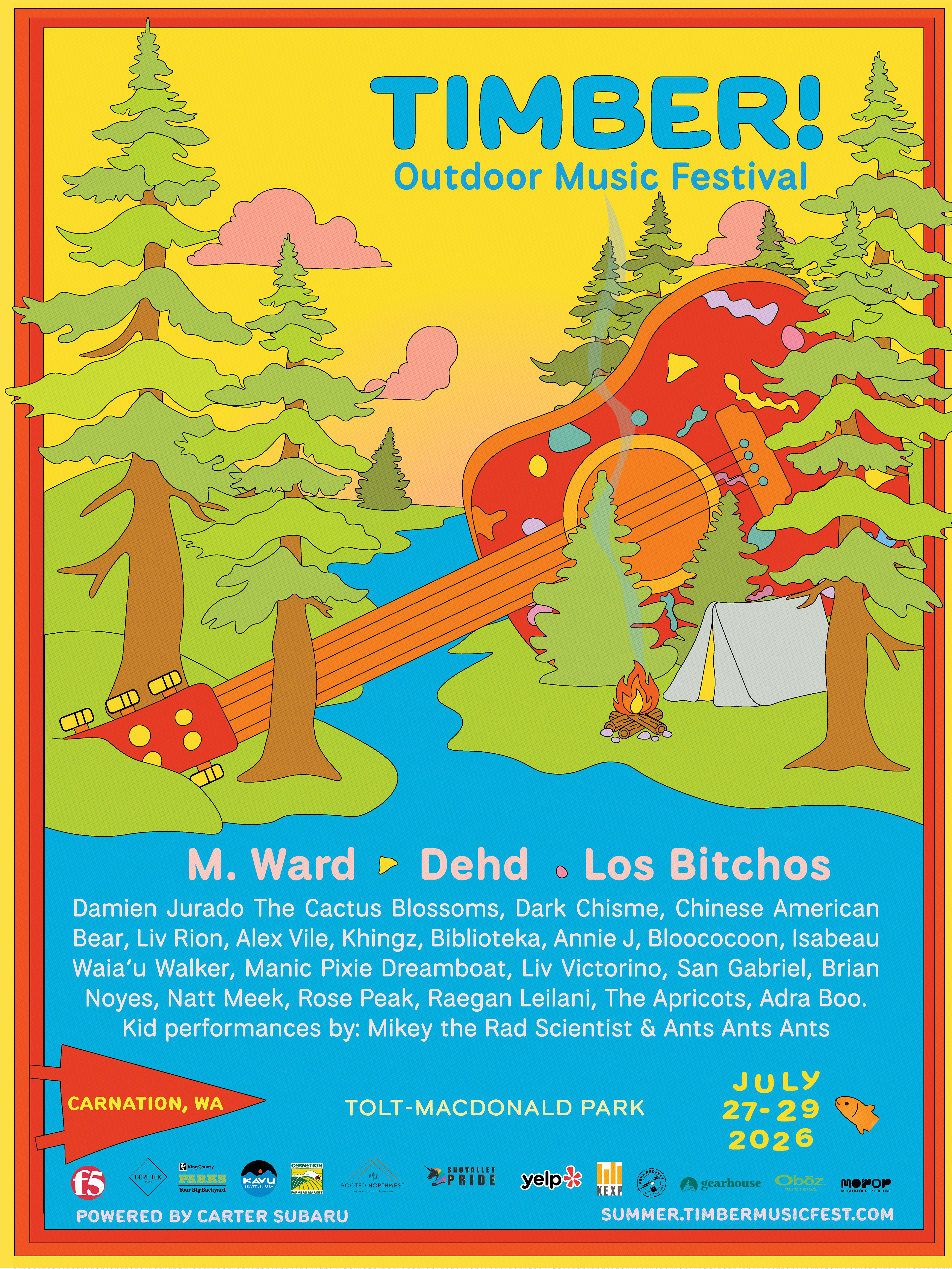
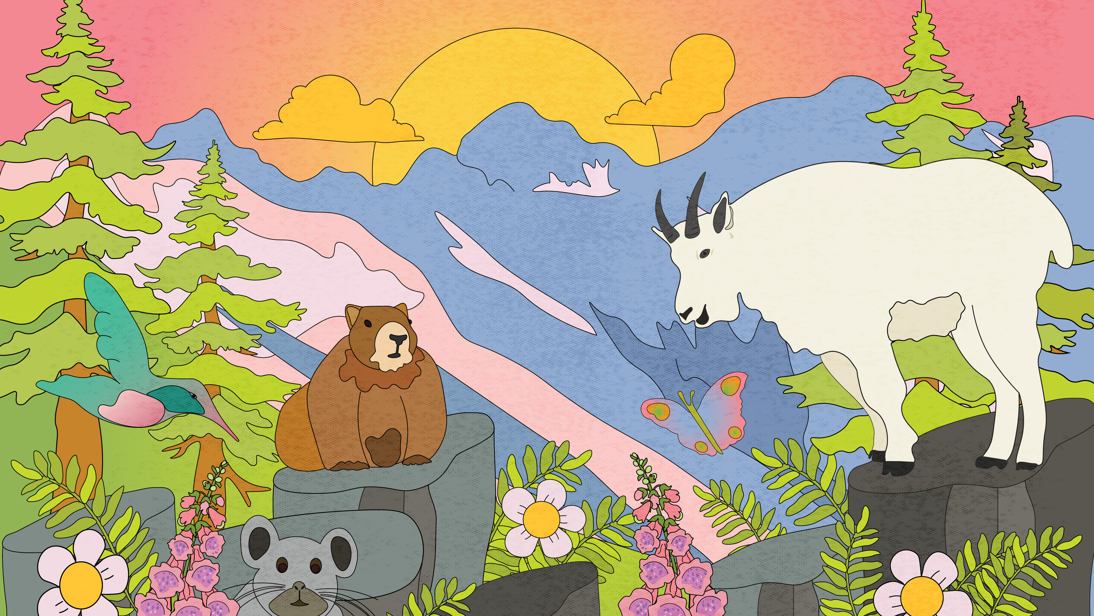
Solution: By anchoring the identity in a warm color palette, the design establishes an inviting, timely feel. Blending a surrealist musical landscape with organic, hand-drawn logotype elements brings a sense of nostalgia that encapsulates this welcoming family event in the Pacific Northwest. Stripping away unnecessary noise ensures the core branding remains highly scalable and fully functional across any medium.

Timber's team invited me to adapt the artwork for their annual collaboration with Stoup Brewing, a West Coast IPA released each year in celebration of the festival.
Working from Stoup's label template, I reimagined the original illustration to fit the can's format, integrating my logo into the final design. The result, Timbeer!, is now available across all four Stoup Brewery locations as well as Timber! Outdoor Music Fest, and has become a standout favorite among patrons. This is a piece of my creative work now in the world as a product people seek out.
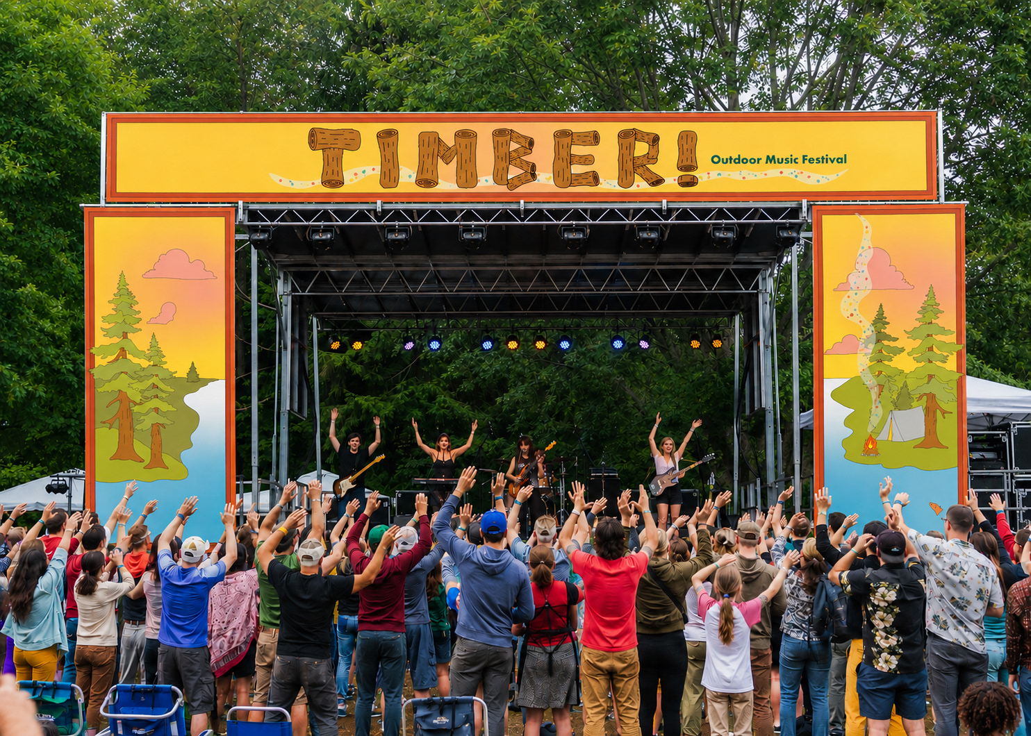
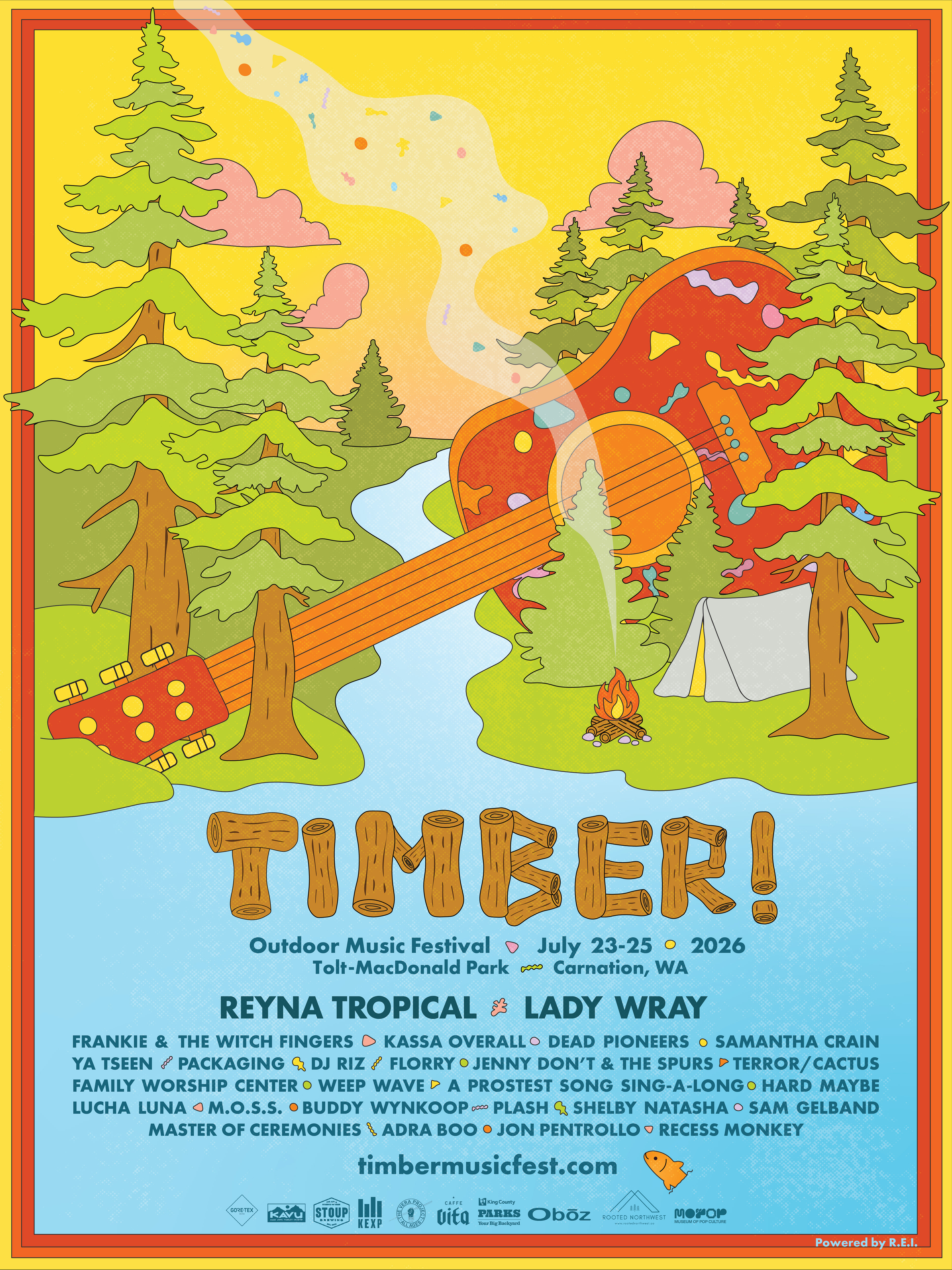
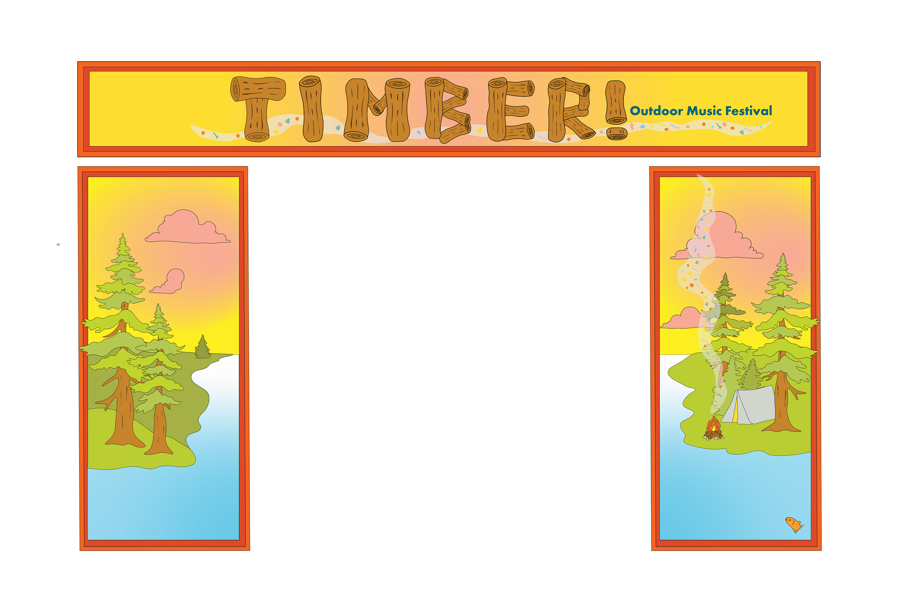
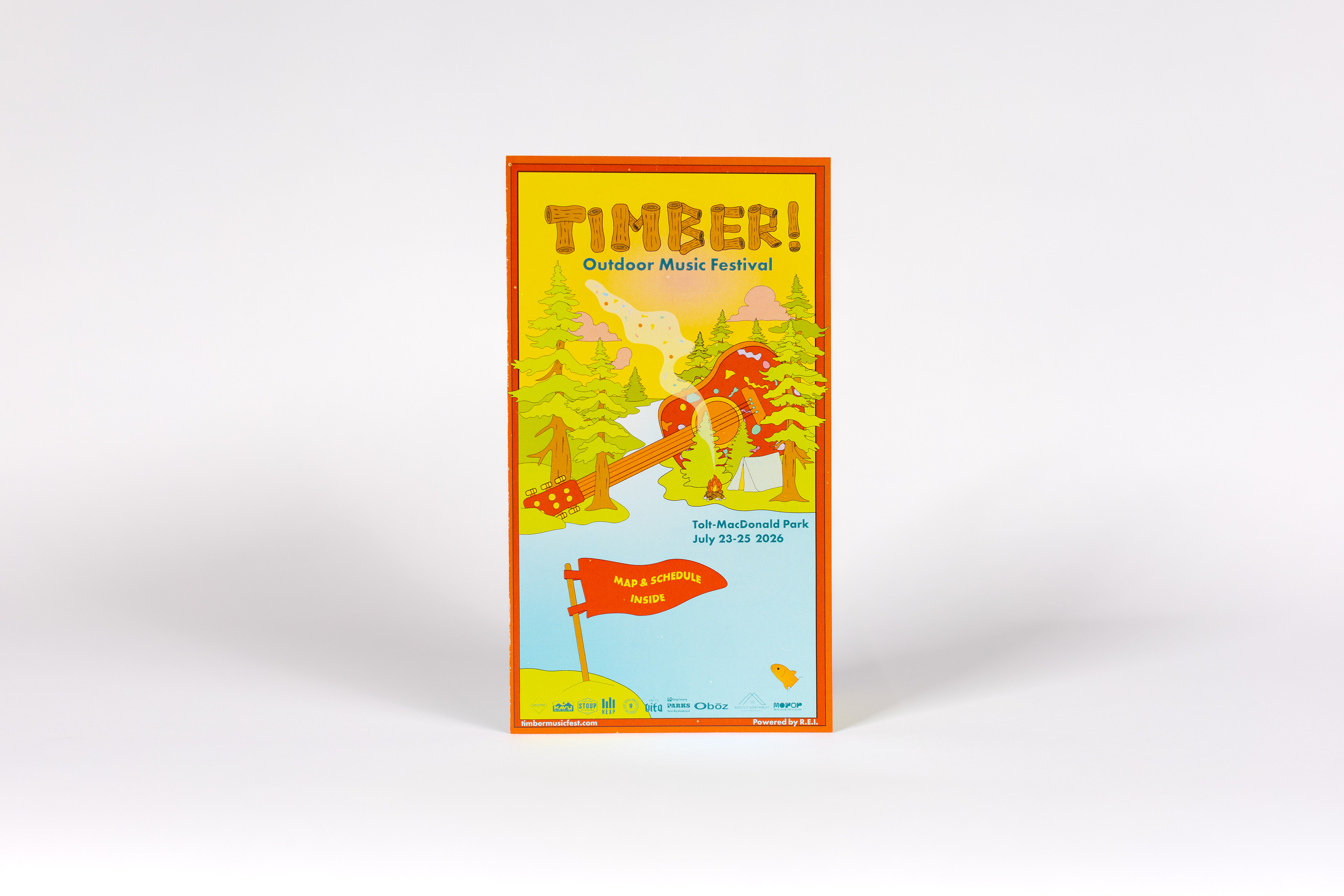
Poster & Stage Design:
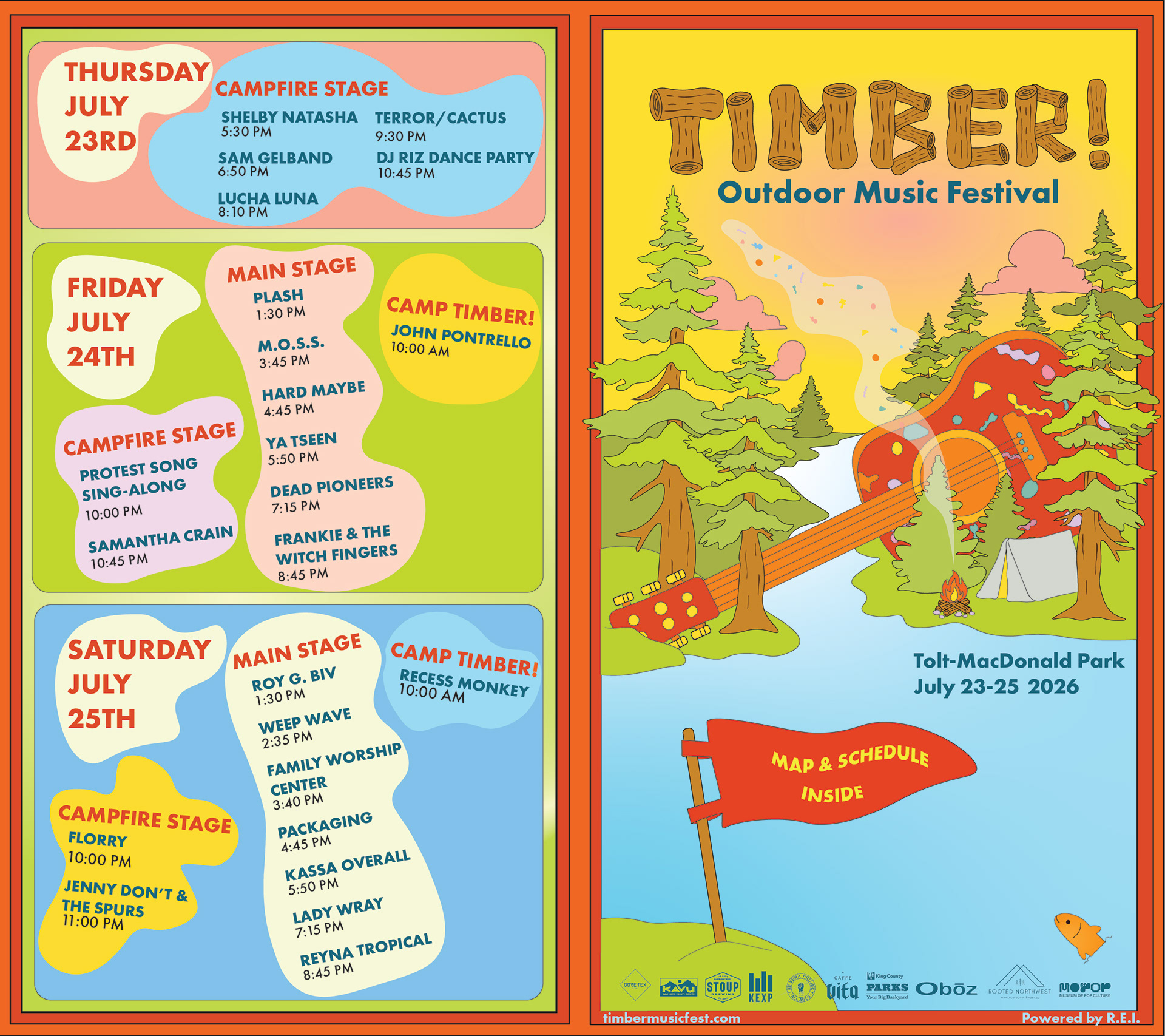
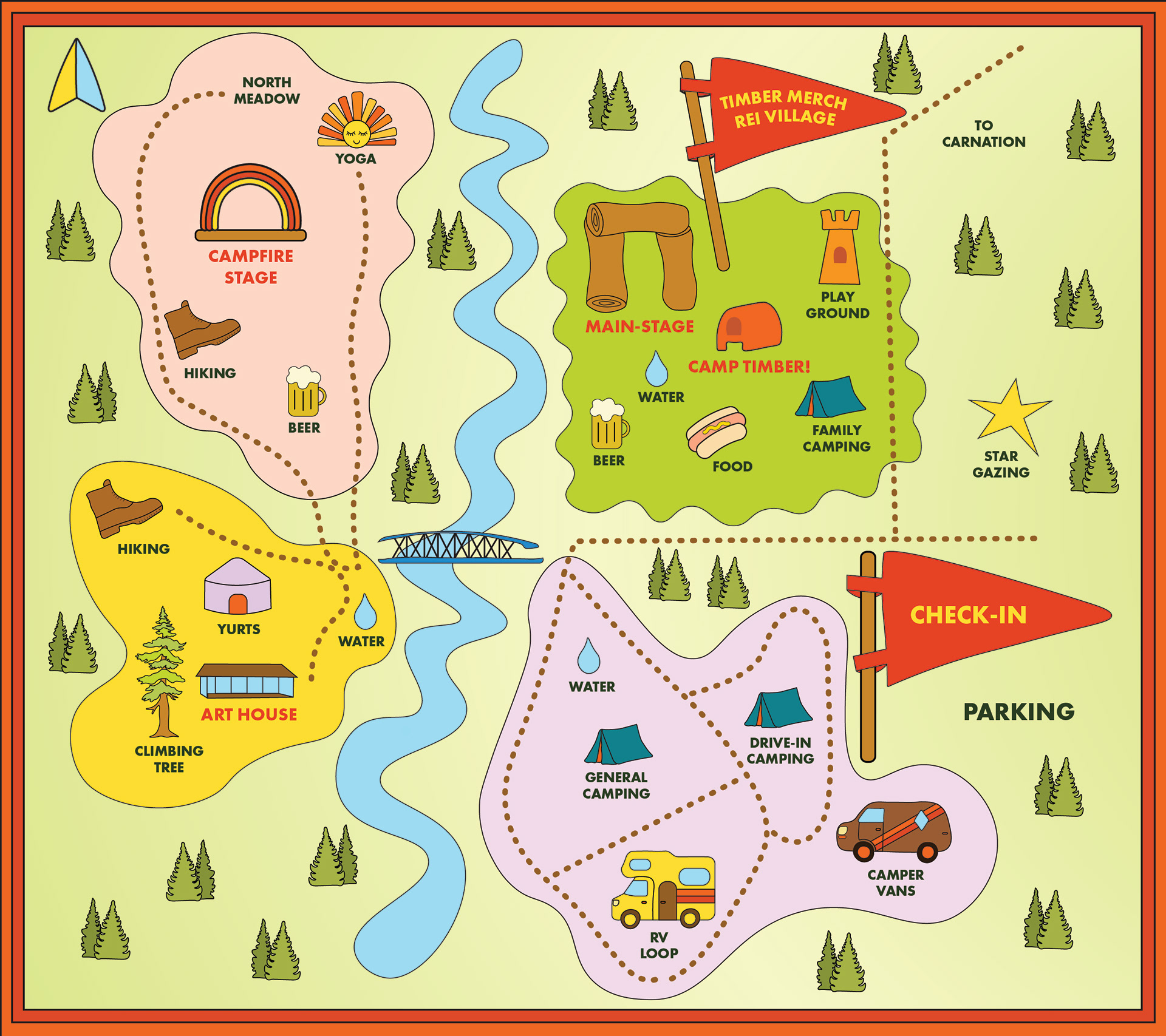
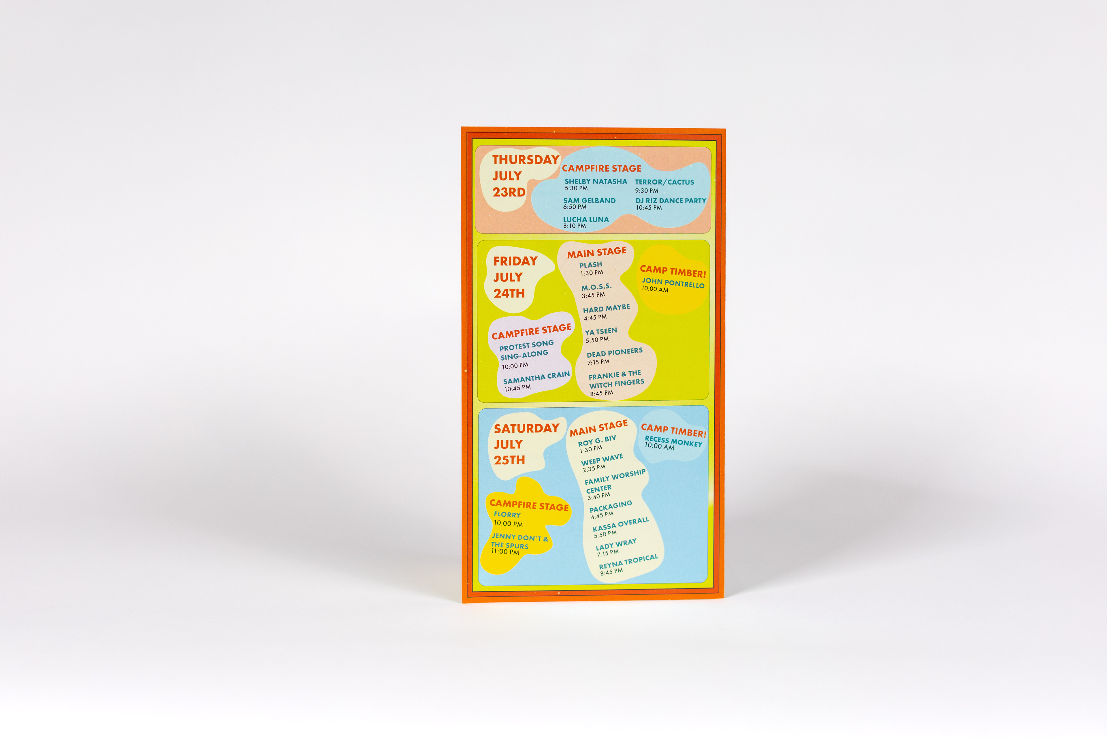
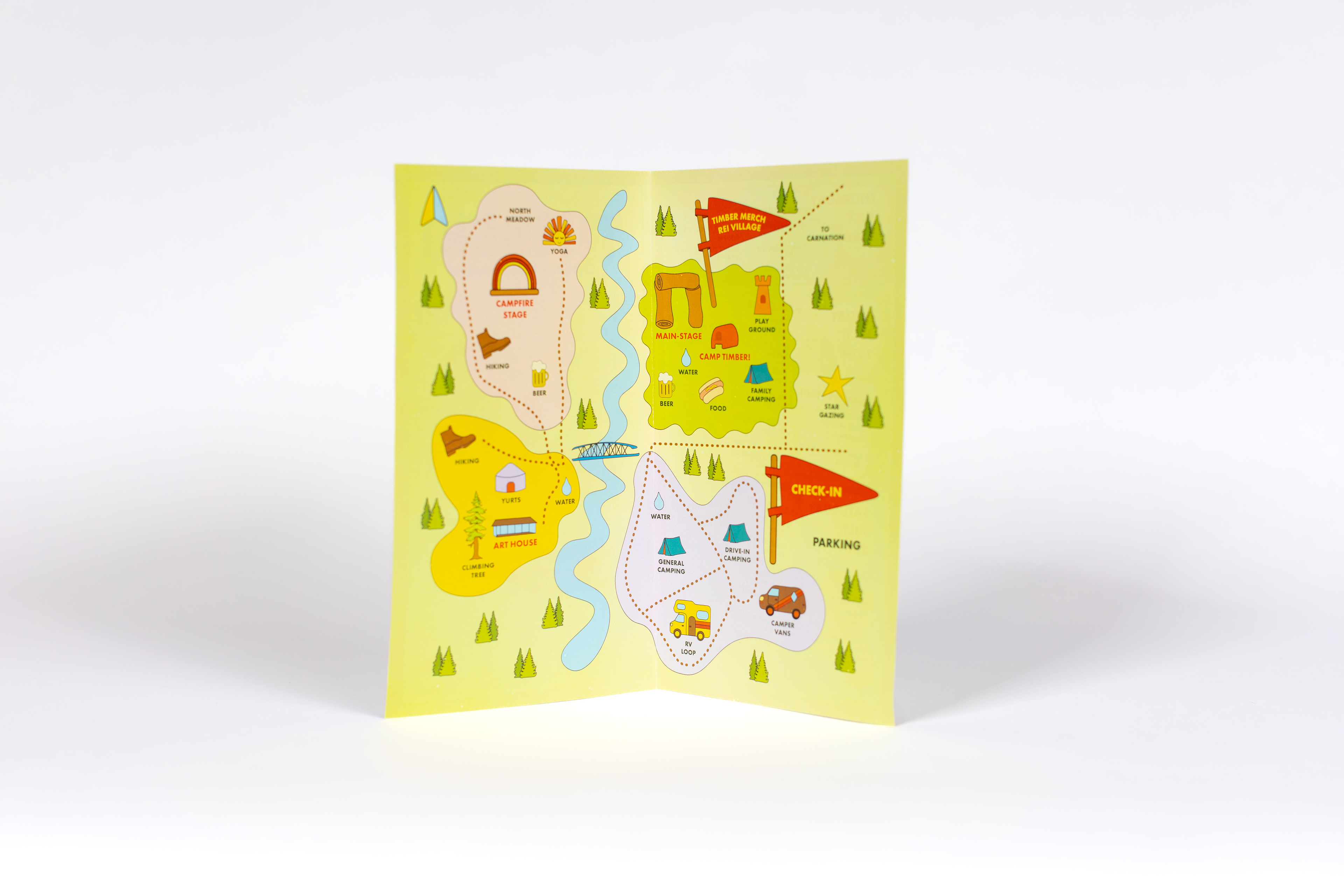
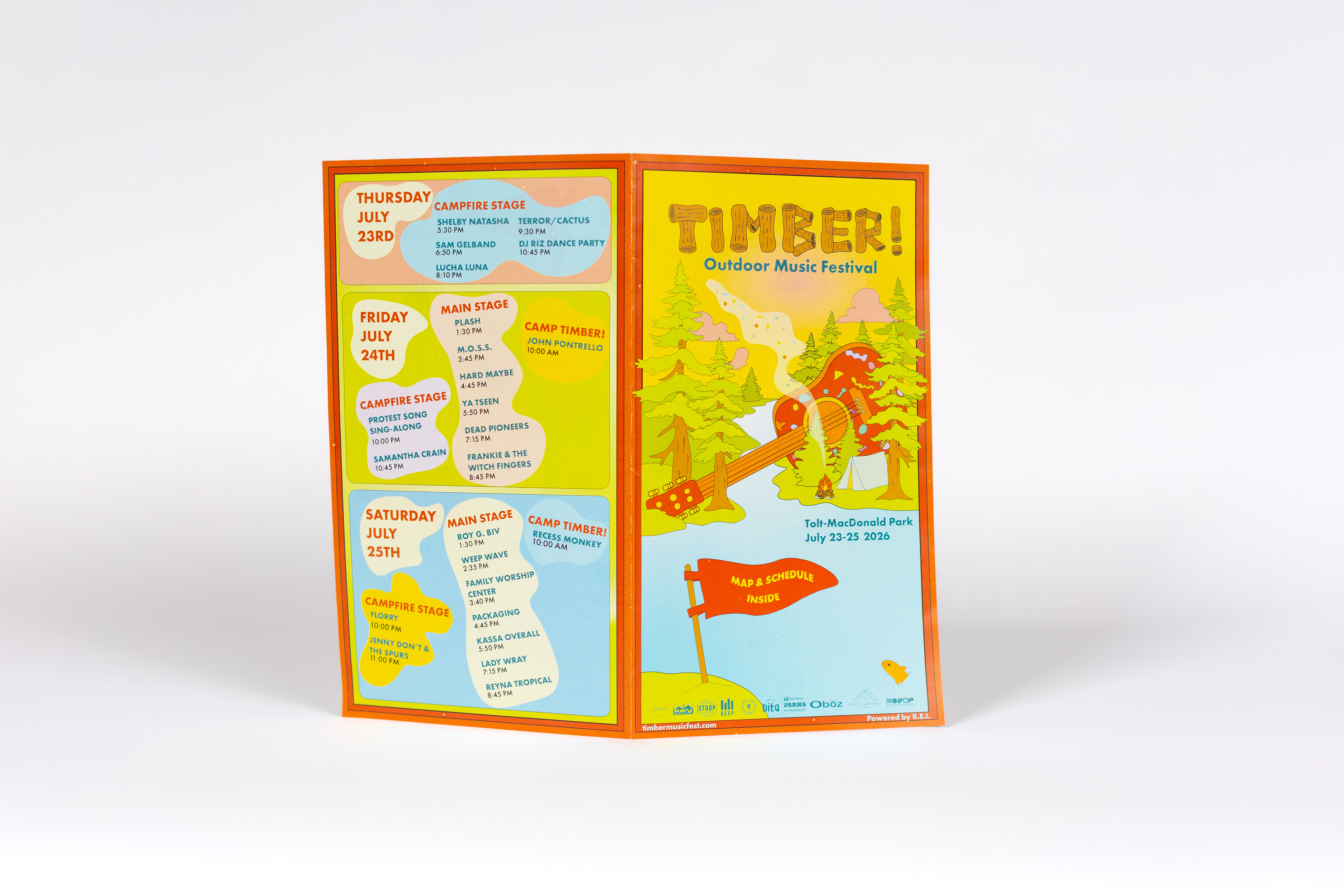
Map & Schedule Pamphlet
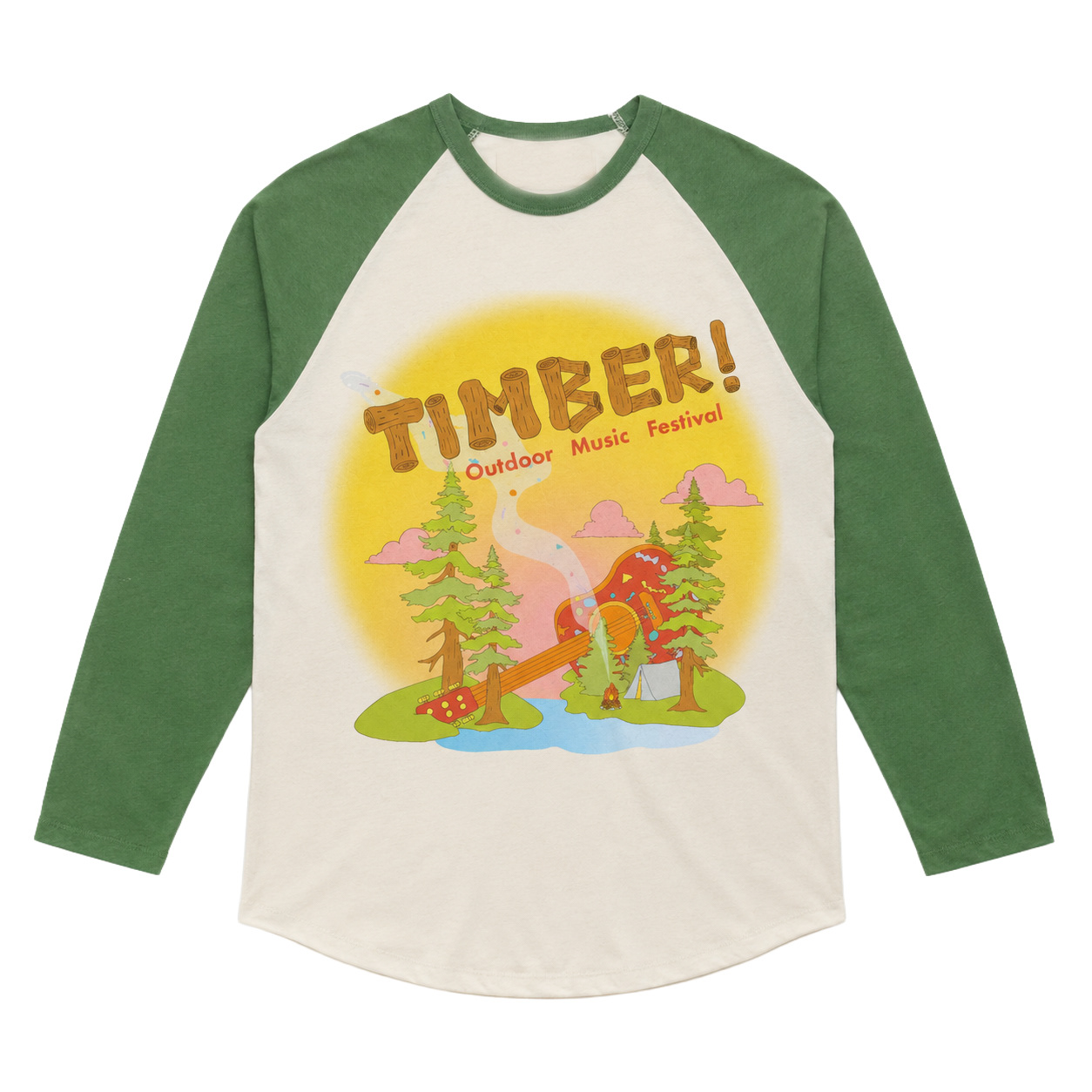
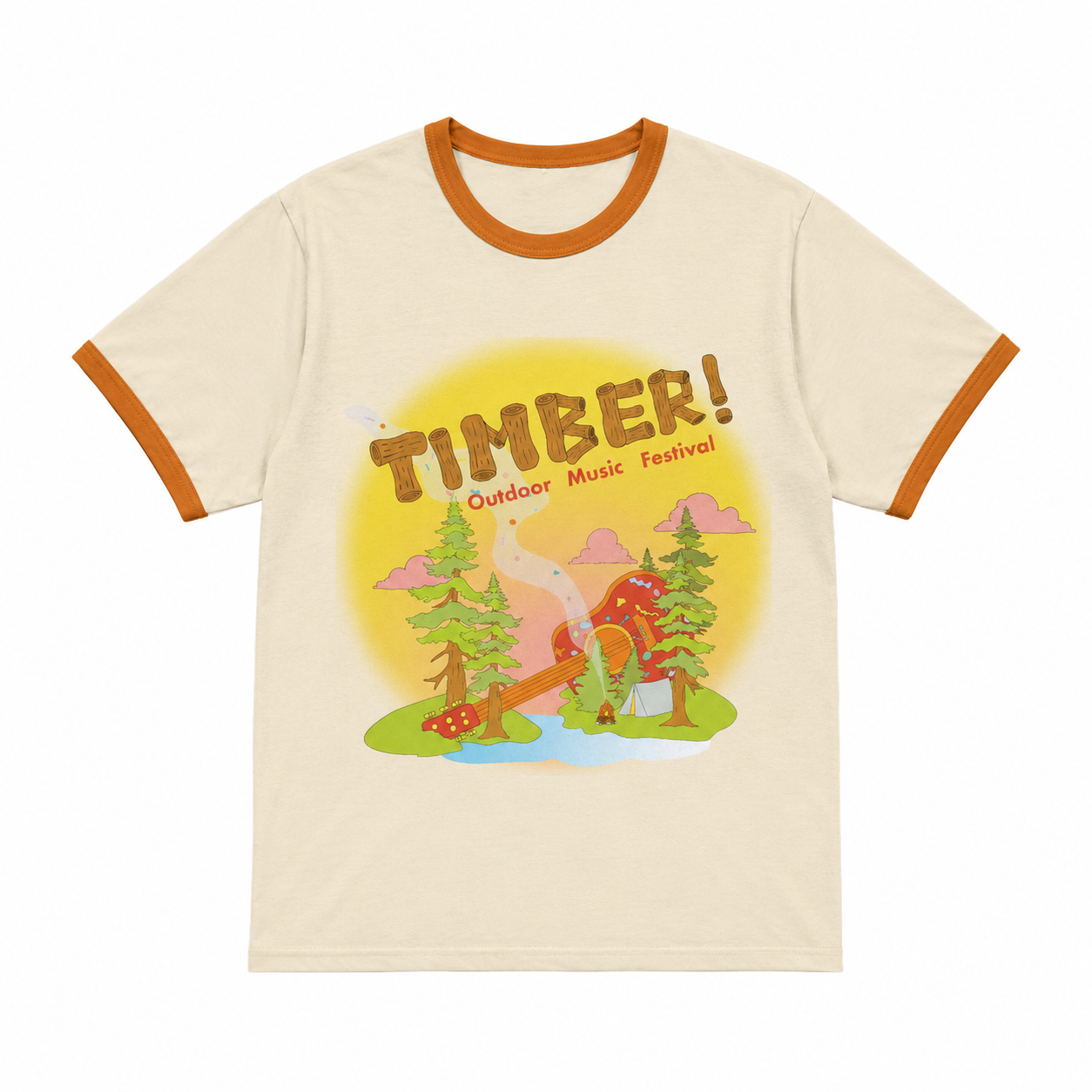
Festival Shirts:
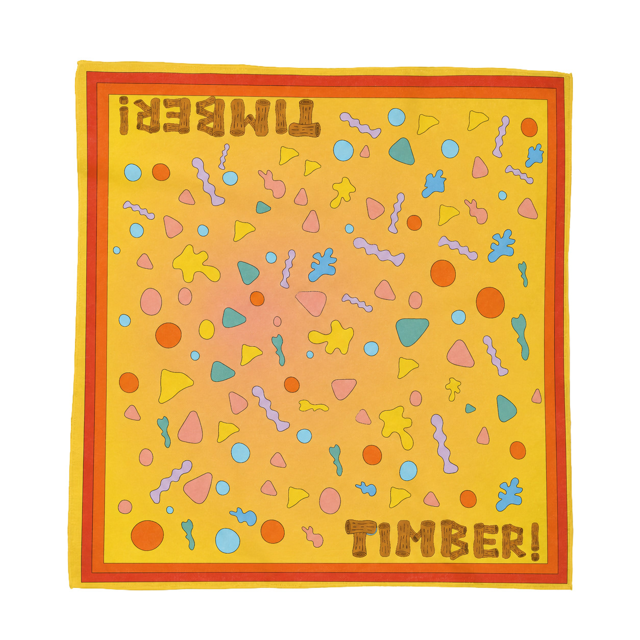
Festival Bandana:
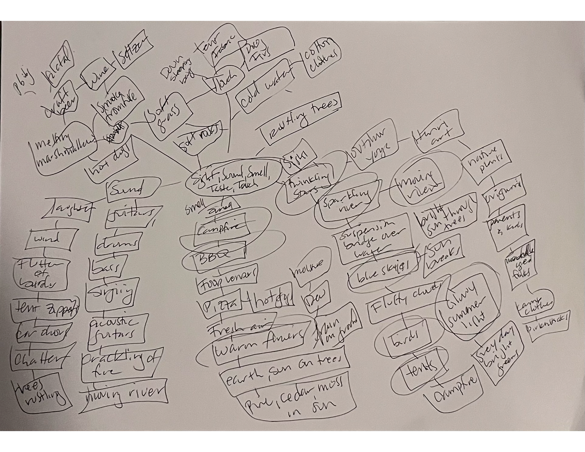
Process: The foundation of this design started with a complete sensory mind map. Instead of solely focusing on the music, I mapped out the holistic environment of the weekend, everything a festival-goer would see, hear, smell, and feel.
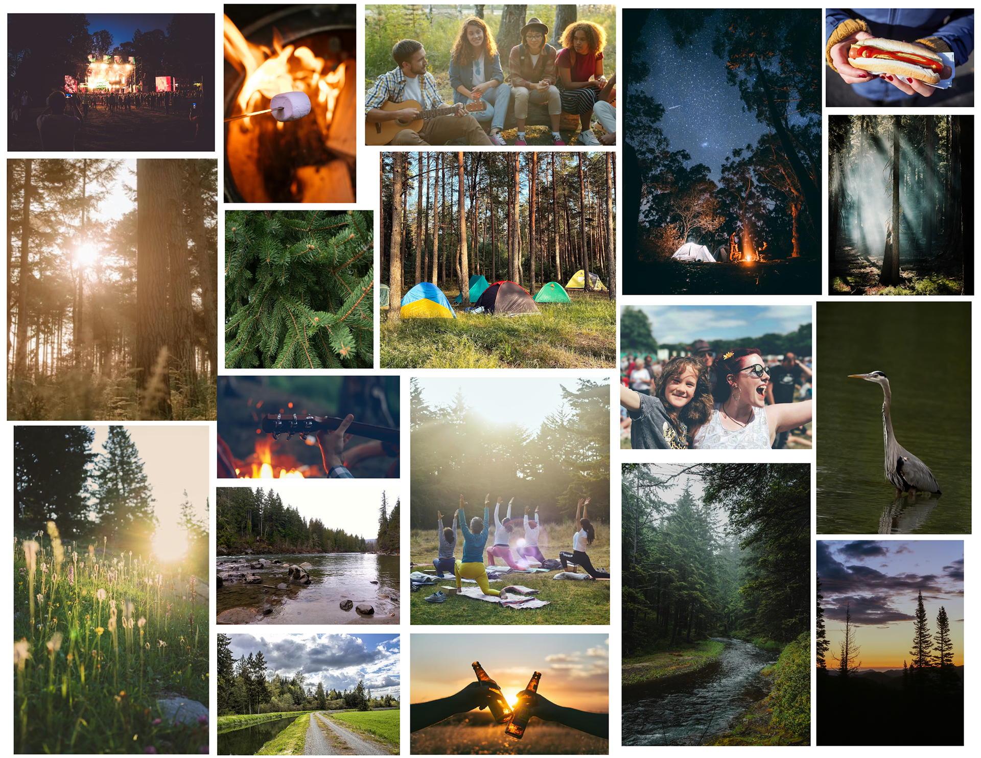
Next came an Identity Board, where I chose imagery to reflect the mood I wanted to evoke. Through this process, I was able to visualize the kind of illustration style and color palette that would set the tone. This step helped create a cohesive visual identity that captured the essence of the festival and would resonate with audiences of all ages.
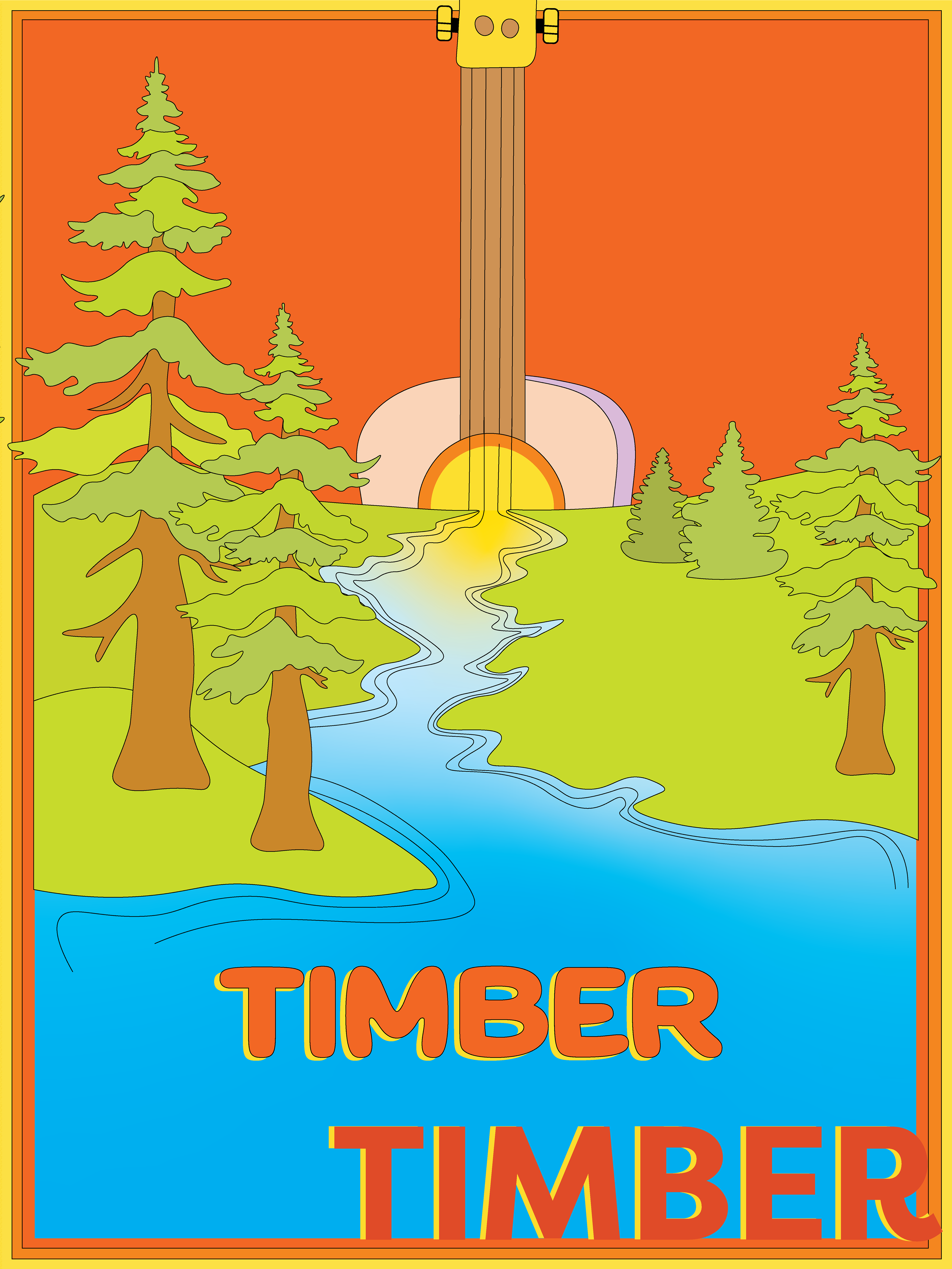
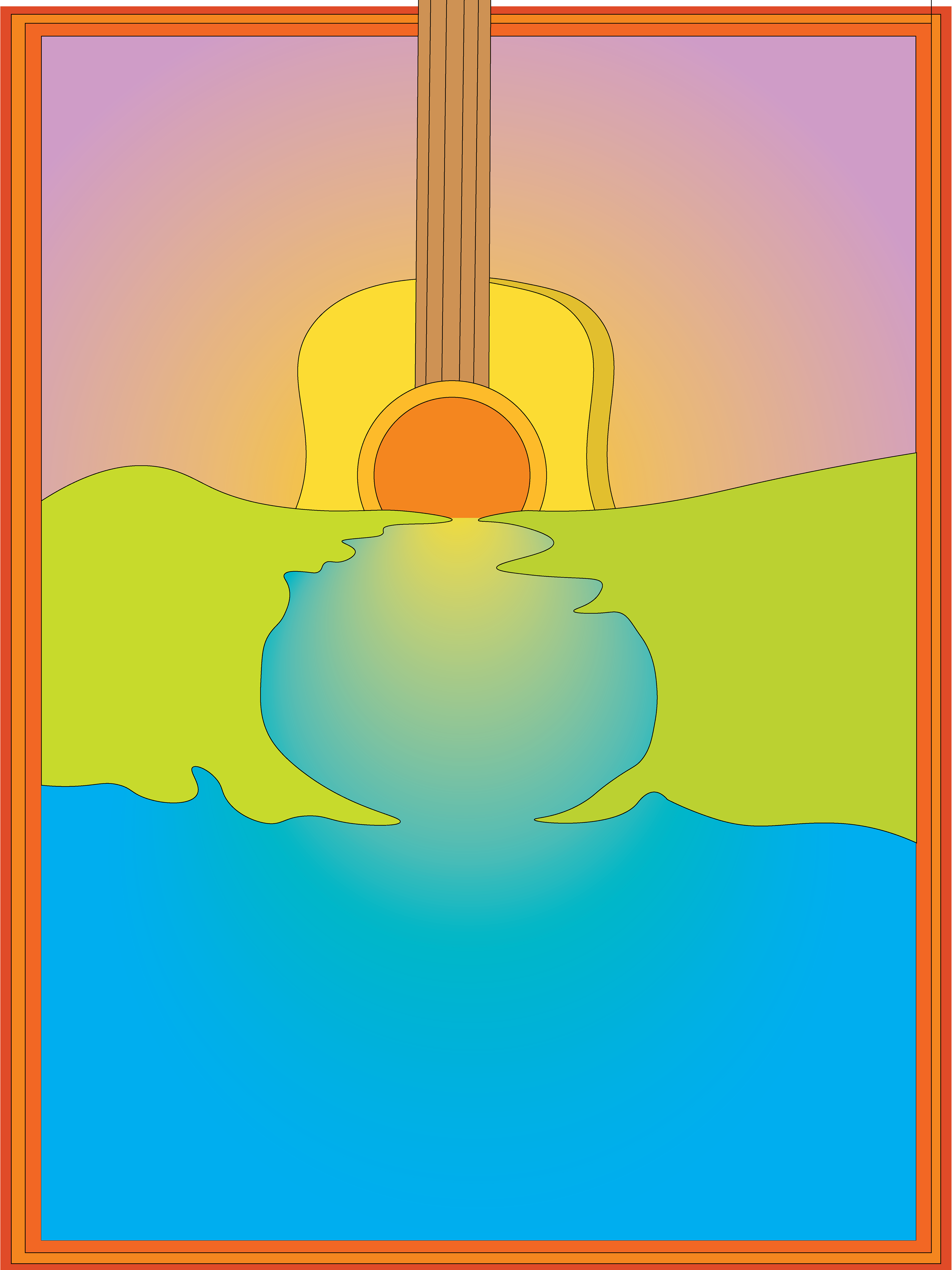
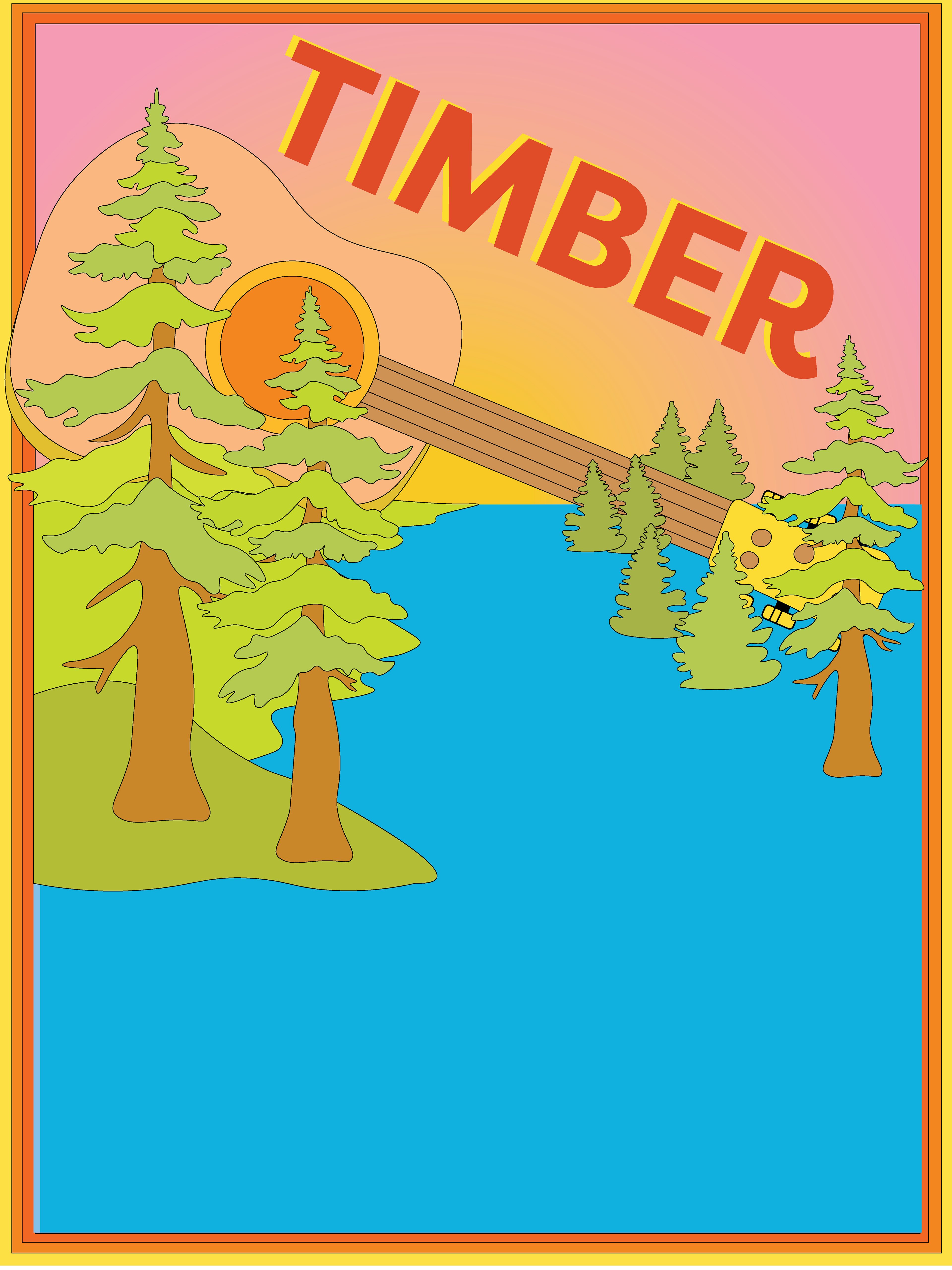
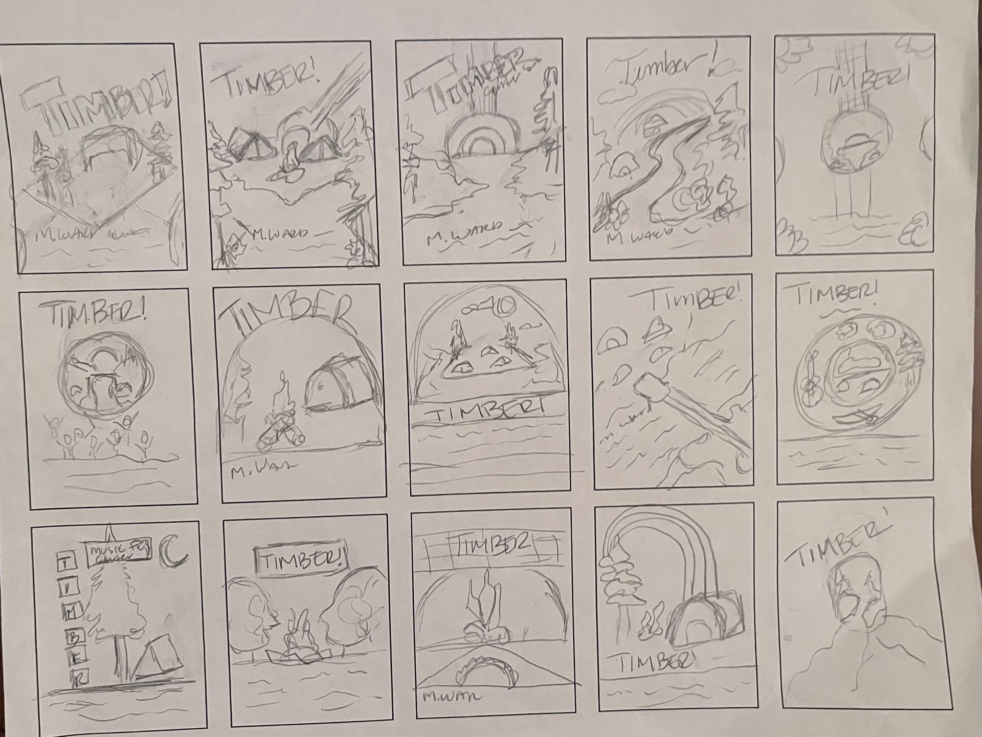
To translate these concepts into a layout, I created 20 thumbnail sketches, experimenting with scale, perspective, and how to intertwine the music with the landscape.
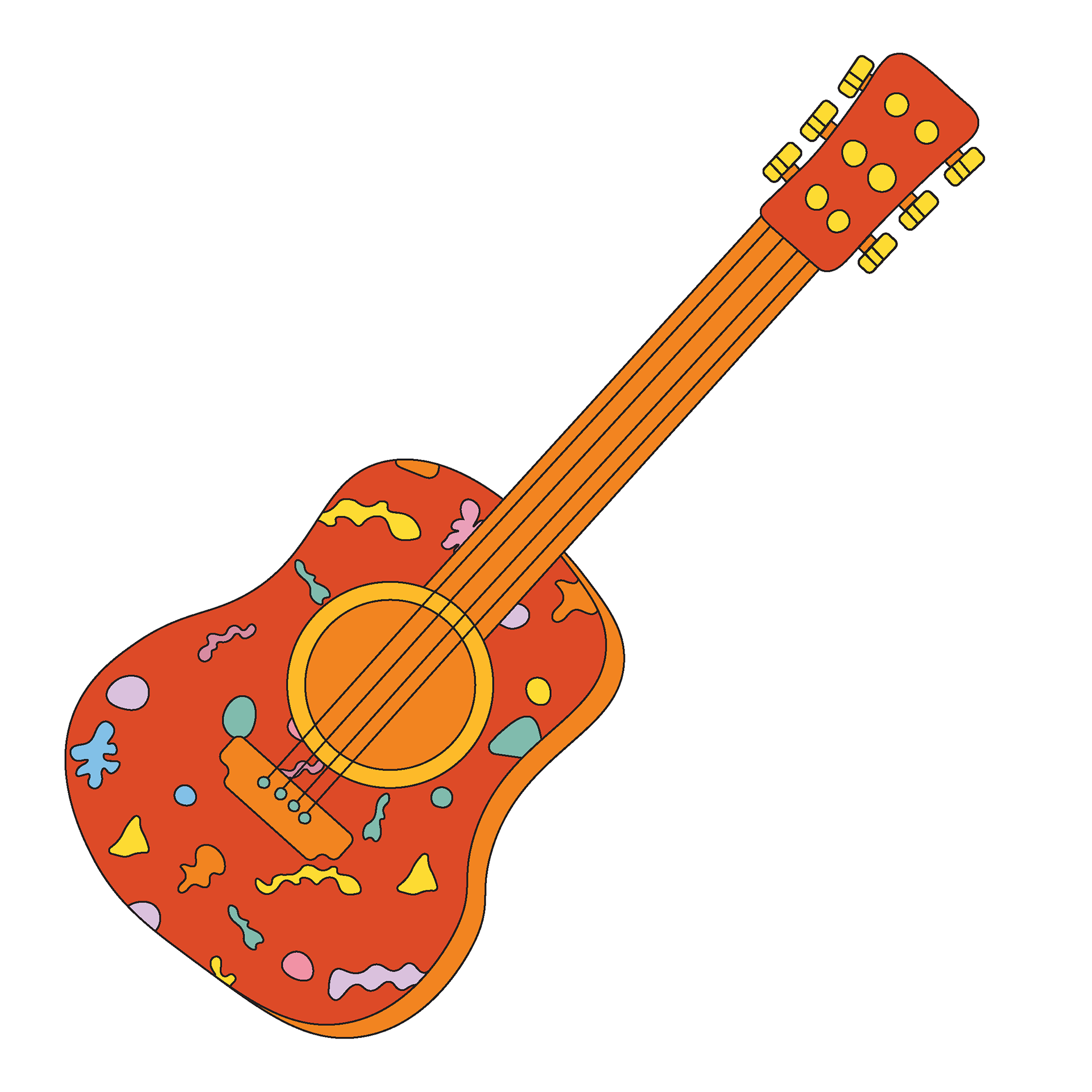
The breakthrough came by merging musical elements directly into the geography. I knew I wanted a massive guitar woven into the landscape, either as a sun, as the bridge festival-goers use to cross the river, or as an element that has fallen like a tree. Timber!
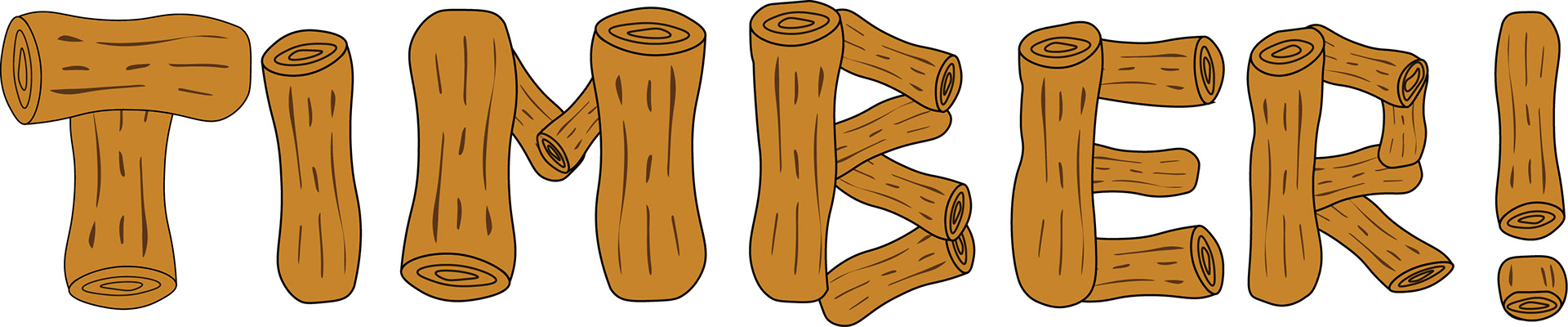
I ended up creating my own typeface for this project because I couldn't find a headline choice bold enough. It's built from illustrated logs, anchoring the festival's identity squarely in the playful, earthy world established by the rest of the composition.
Drafts: