
Overview: Alpine Lore is a publication designed to bridge the gap between outdoor recreation and a deeper understanding of the ecological and cultural significance of alpine landscapes.
Challenge: As outdoor recreation continues to surge, many hikers engage with alpine environments primarily as destinations, often lacking awareness of their ecological complexity and cultural history.
Solution: Alpine Lore translates complex ecological and cultural knowledge into an accessible, visually engaging editorial experience. Through a balance of storytelling, photography, and intentional design, the magazine invites readers to slow down, observe more closely, and develop a deeper sense of respect and responsibility for the alpine environment.
Roles:
Brand Designer
Art Director
Copywriter
Designer
Photographer
Time Frame: 12 weeks
Tools: InDesign, Photoshop, Illustrator
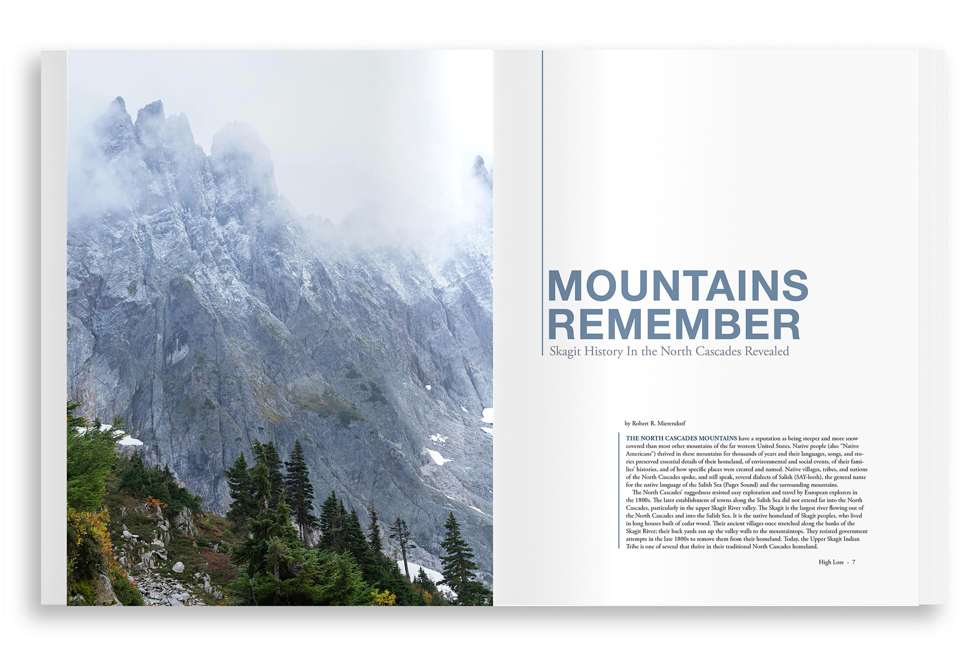
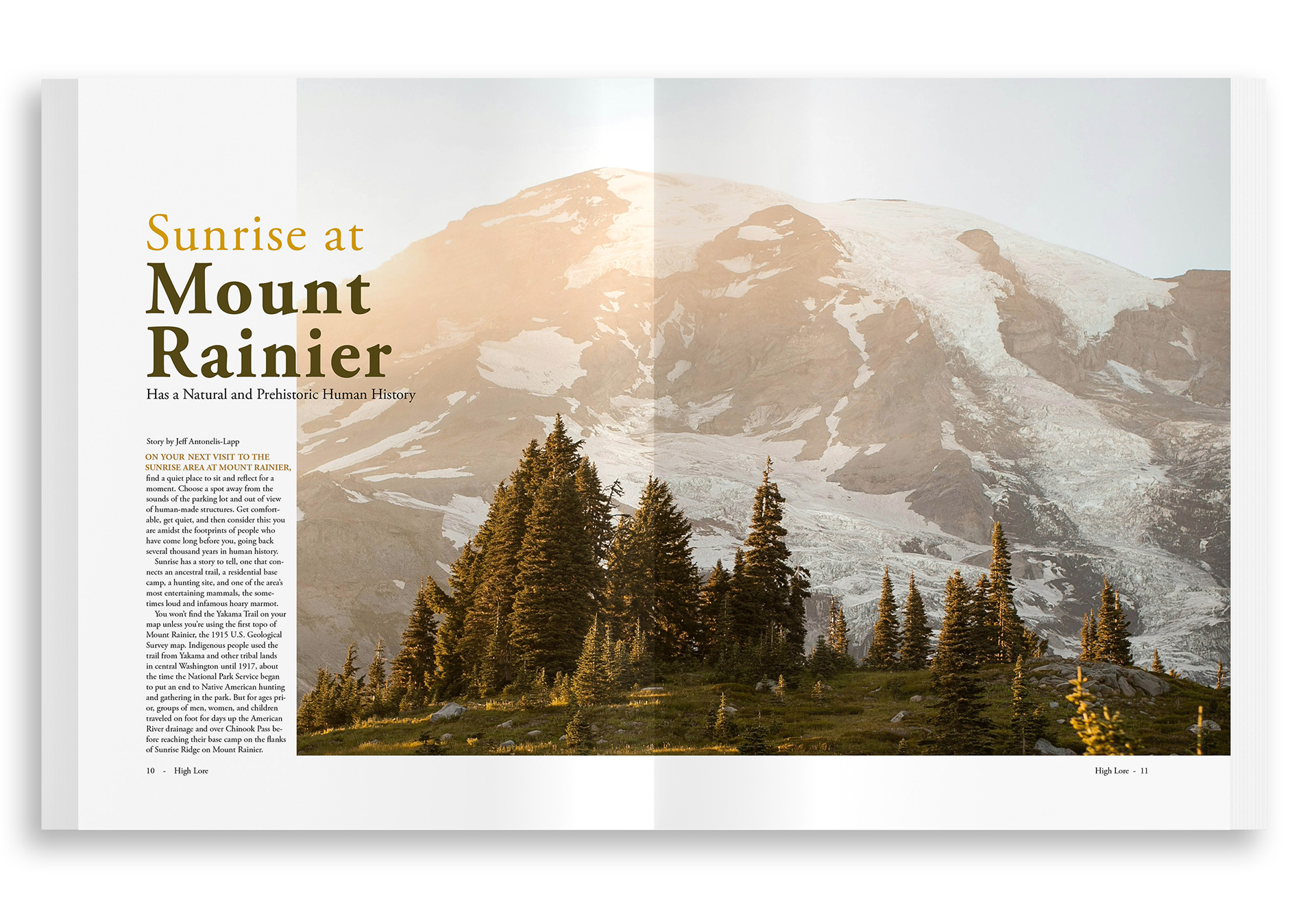
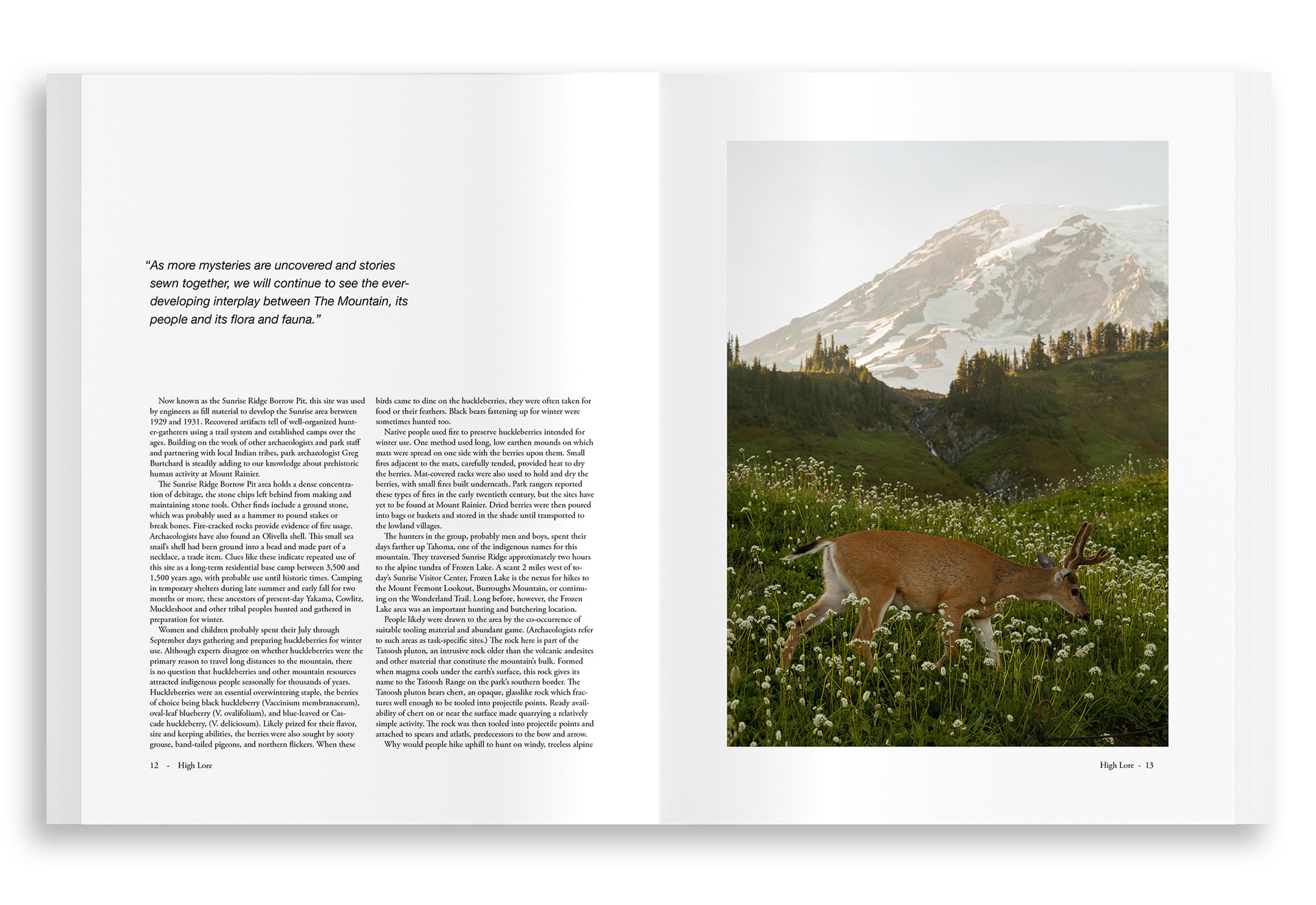
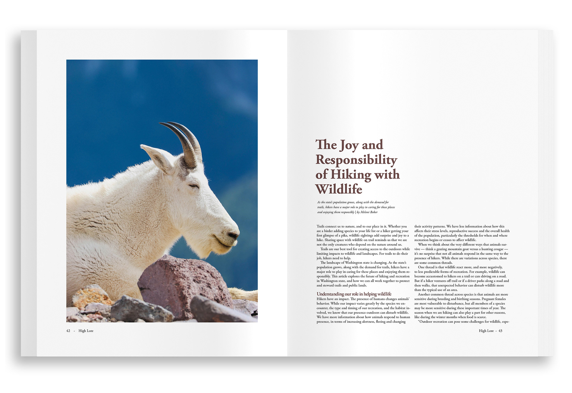
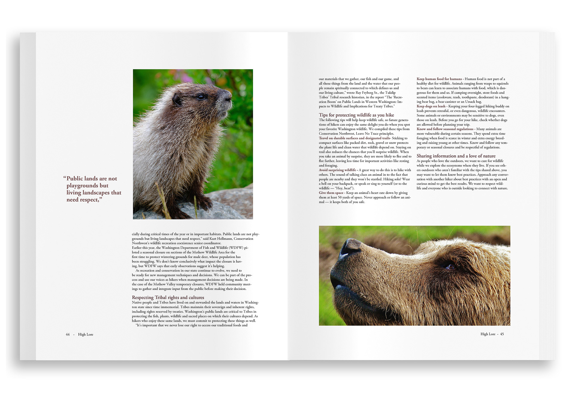
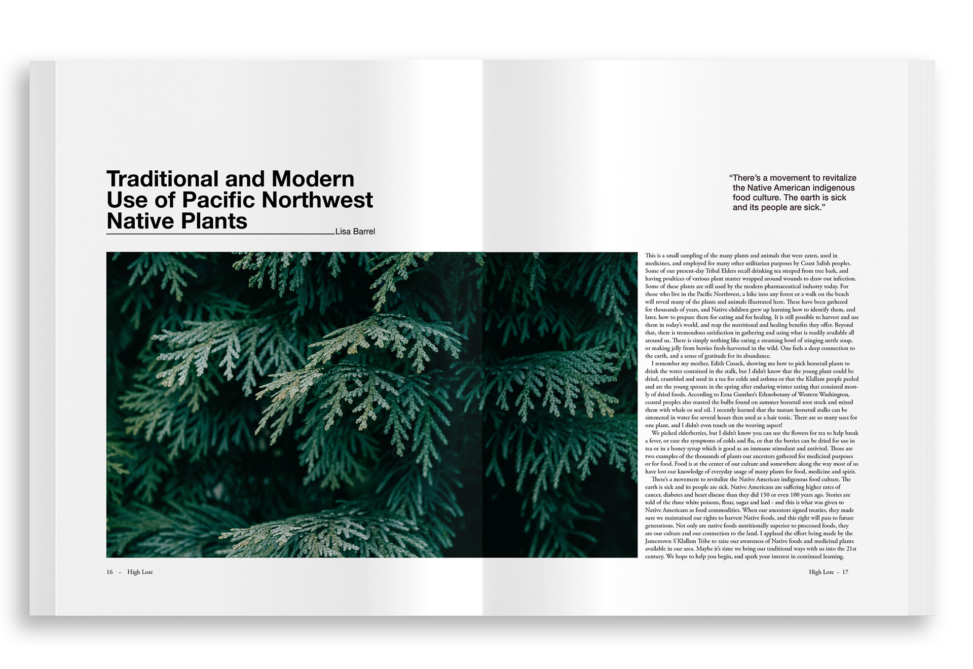
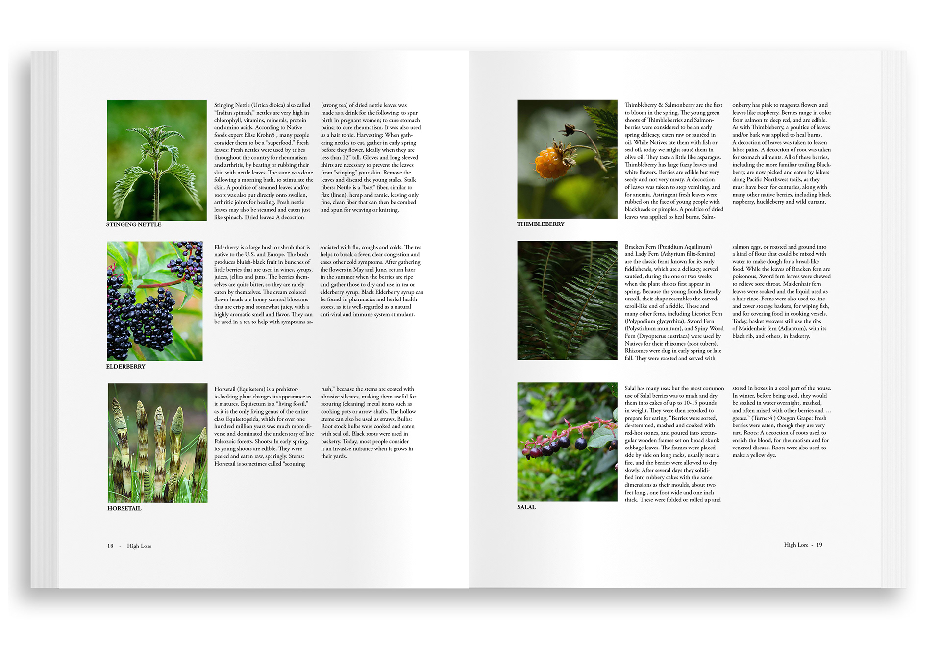
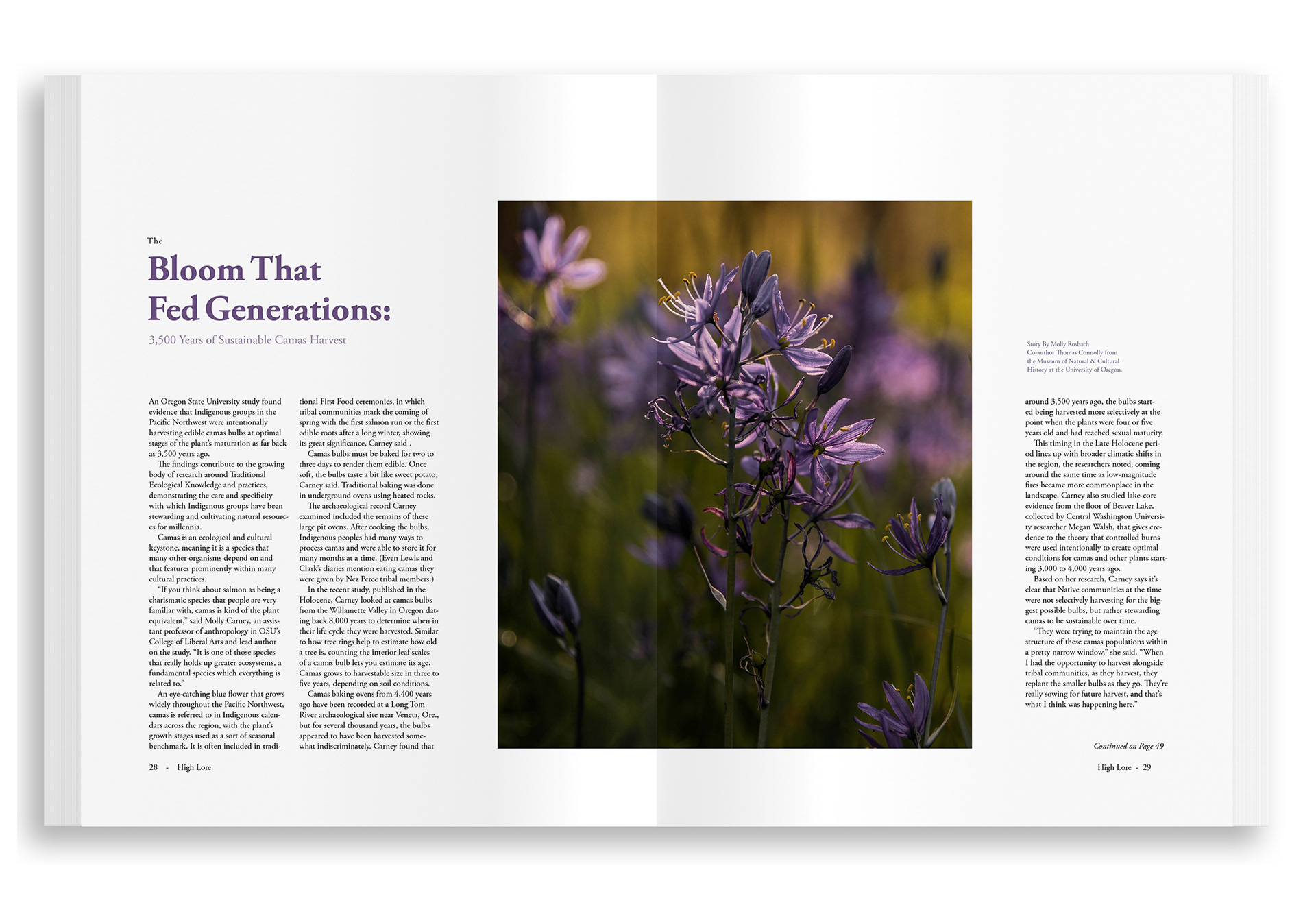
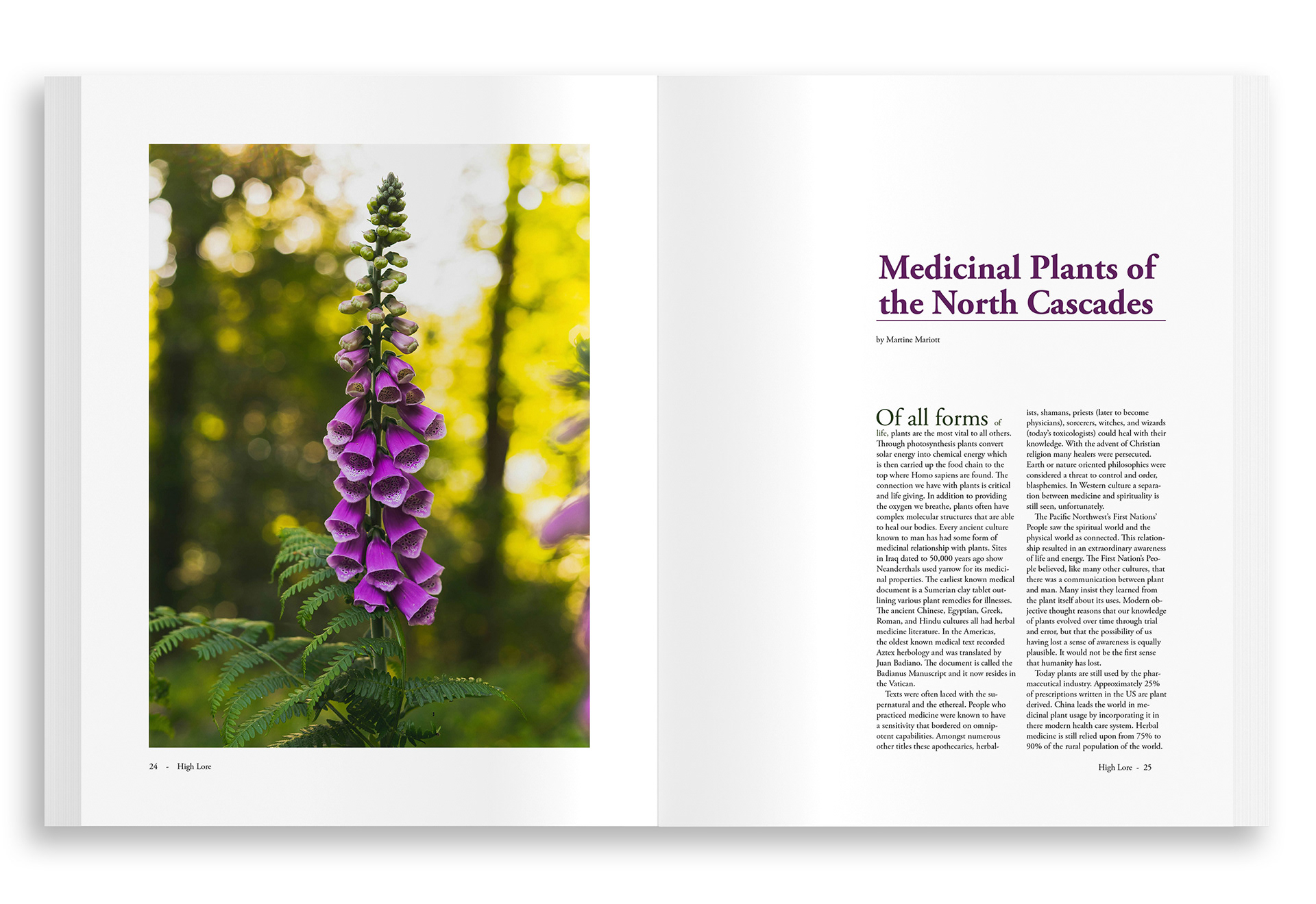
My Process: I began making High Lore by drafting a synopsis of the magazine's contents and purpose. What kind of magazine did I want it to be, and why should it exist?
High Lore is a cultural ecology magazine devoted to the world's alpine wilderness regions. Each issue focuses on a specific high-altitude landscape-beginning with the Cascade Mountains- through a lens that honors both ecological science and the human histories that have shaped these places.
As hiking grows in popularity, High Lore reminds readers that mountain regions are more than scenery: they are ancestral homelands, sacred places, and living ecosystems where people, plants, and animals have coexisted for thousands of years.
With High Lore, we hope to create a bridge: between the field guide and the storybook, between ecological fact and cultural memory. Our goal is to encourage a deeper exploration of the alpine world with respect for the land, its people, and the plants and animals that call it home.
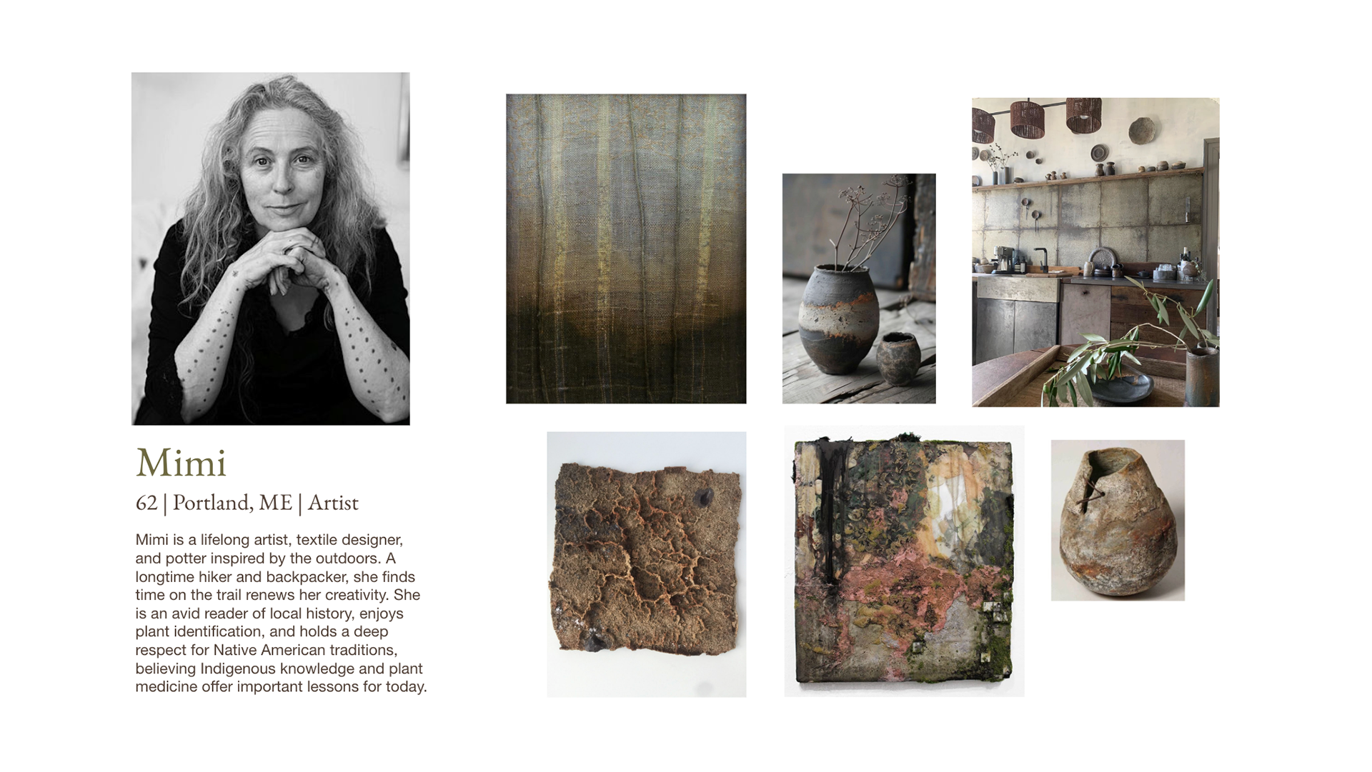
From there, I created personas for the different types of readers High Lore would attract, from those interested in travel, photography, and holistic medicine to those interested in history.
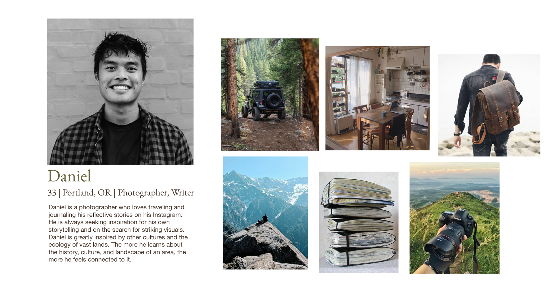
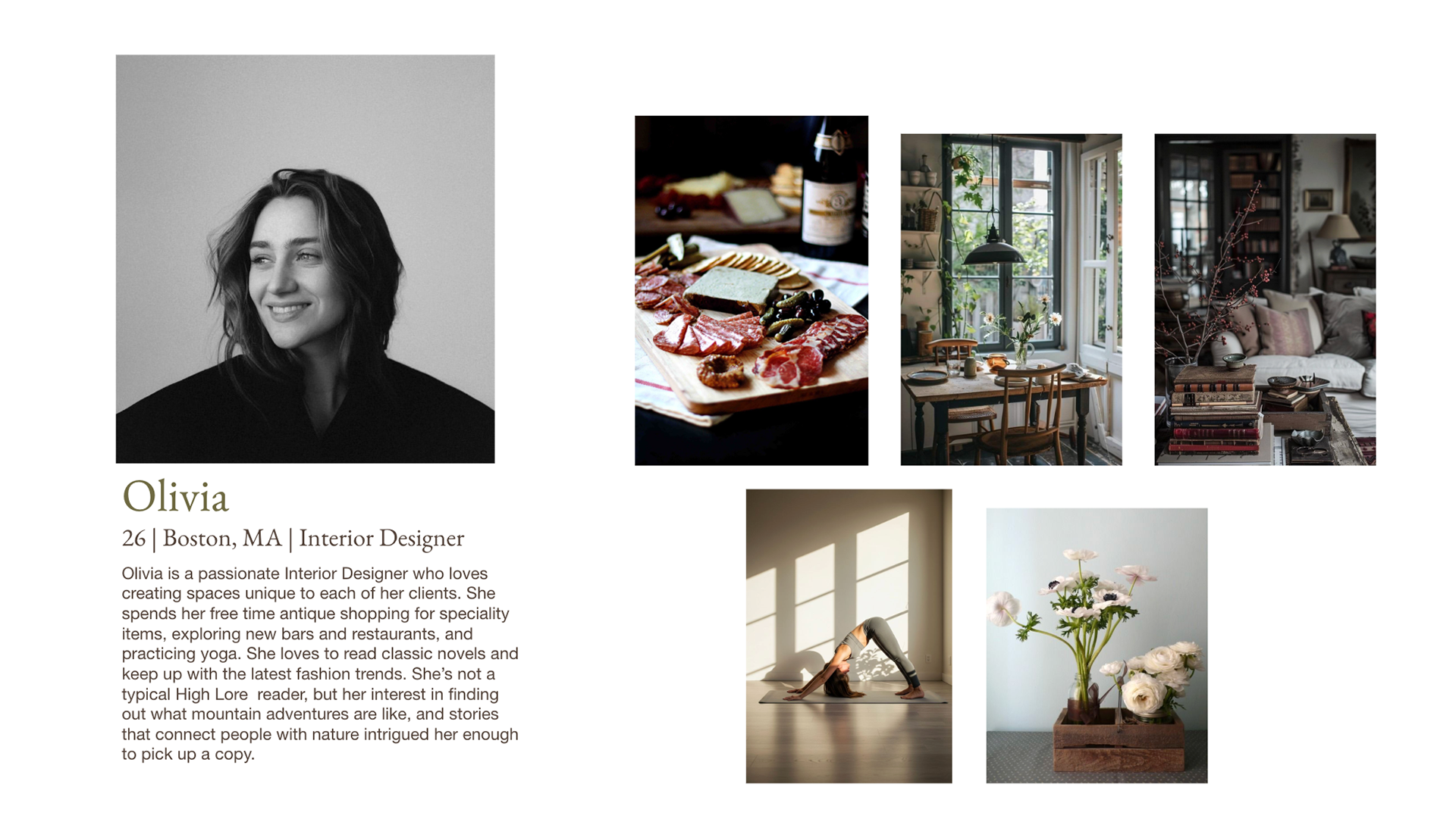
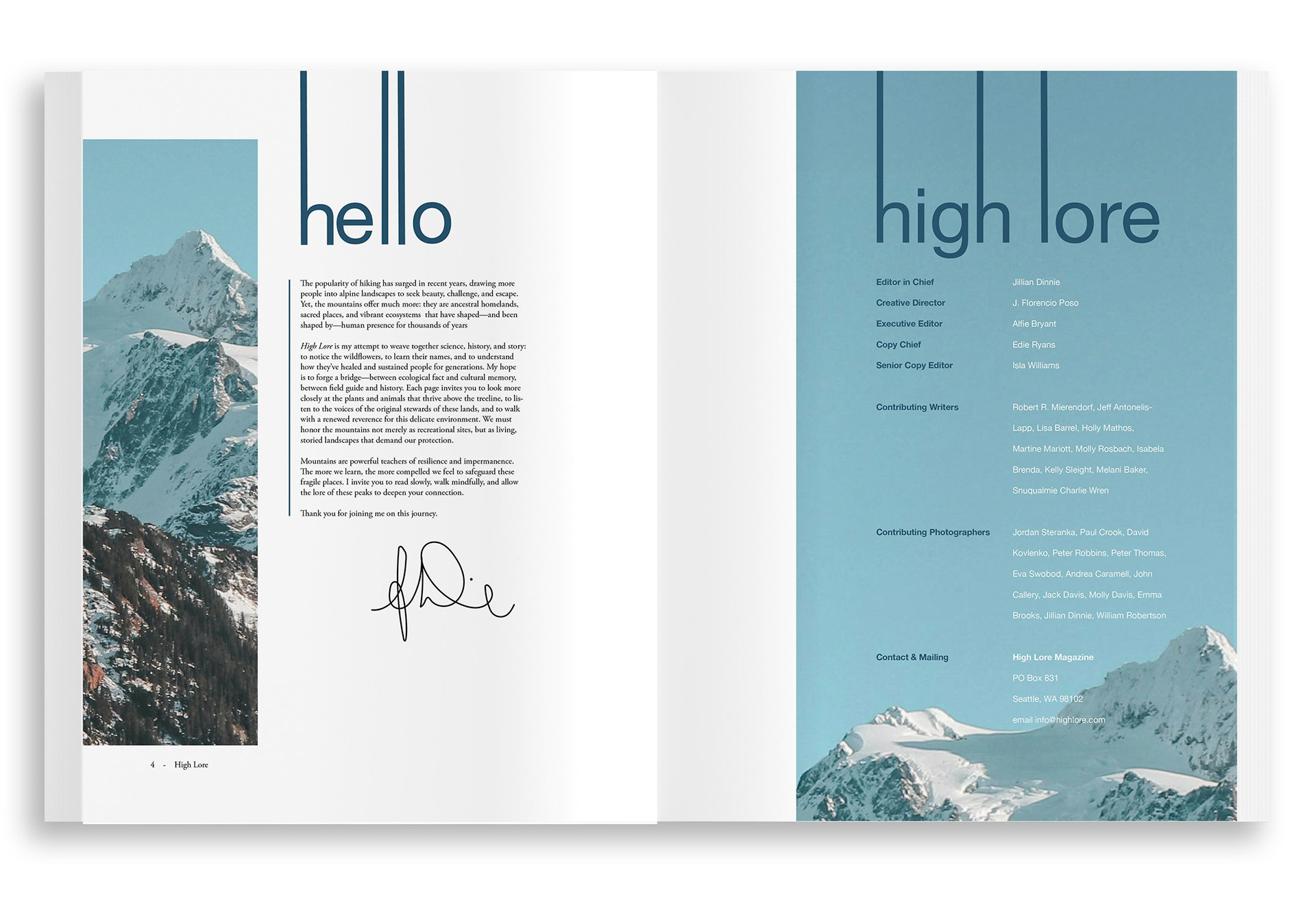
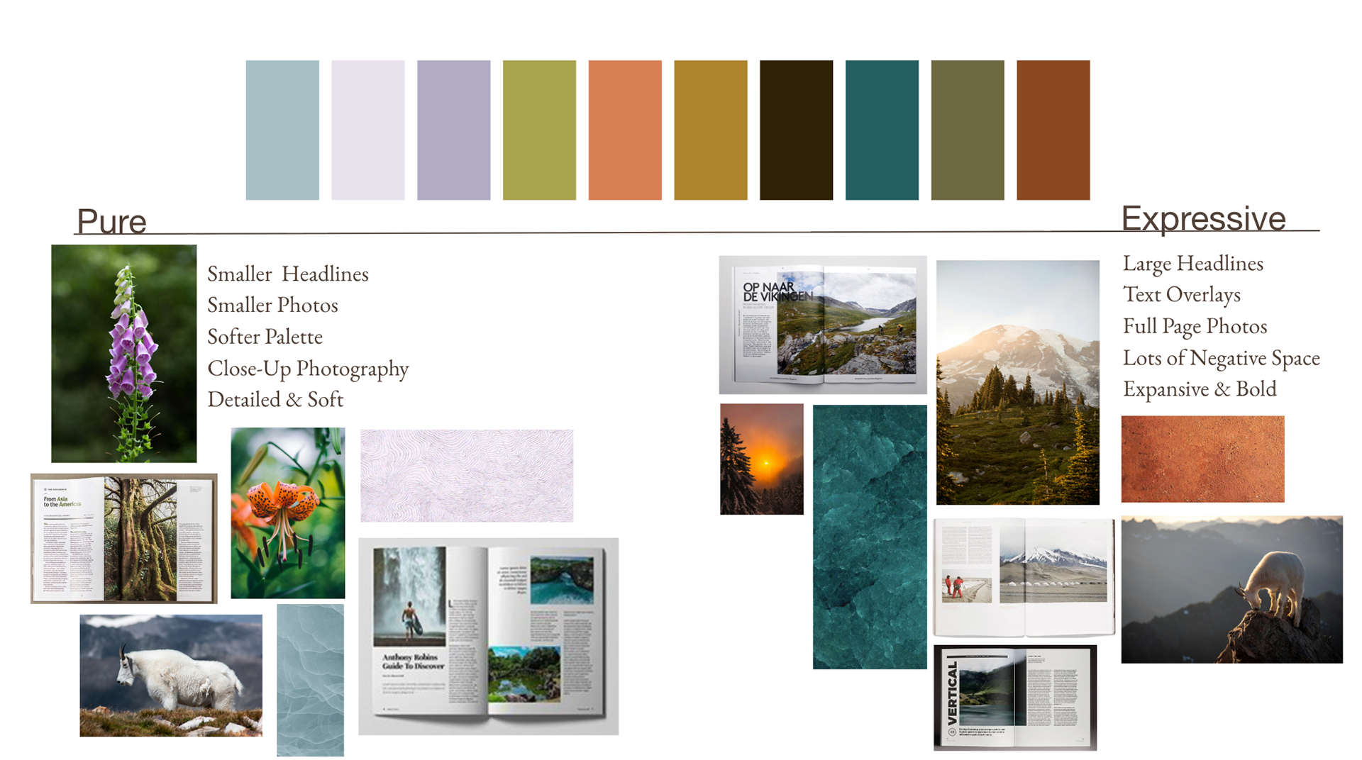
I developed a design recipe, a system of constraints that guided every decision, ensuring consistency, purpose, and visual cohesion throughout the magazine. This framework established key design elements, including generous negative space, bold headlines, text overlays, expansive and close-up full-page photography, a four-column grid, and ragged-right body text.
Using these principles, I created a structure that unified the magazine as a whole while allowing each spread to reflect the unique character of its story. Repeated elements such as line treatments, typographic hierarchy, and body text styles reinforced the publication’s visual identity and strengthened brand consistency.
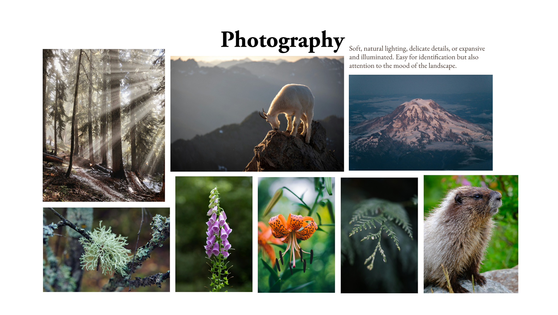
Photography is a vital part of High Lore, as the magazine’s purpose is to connect readers to the landscapes, stories, and ecosystems it explores. As someone who has spent countless hours hiking, observing, and photographing these environments, I was able to incorporate some of my own work throughout the publication. Sourcing additional photography that captured the same sense of place, wonder, and connection to the land was equally important and required careful consideration. Together, these images help immerse readers in the experience and strengthen the magazine’s visual storytelling.
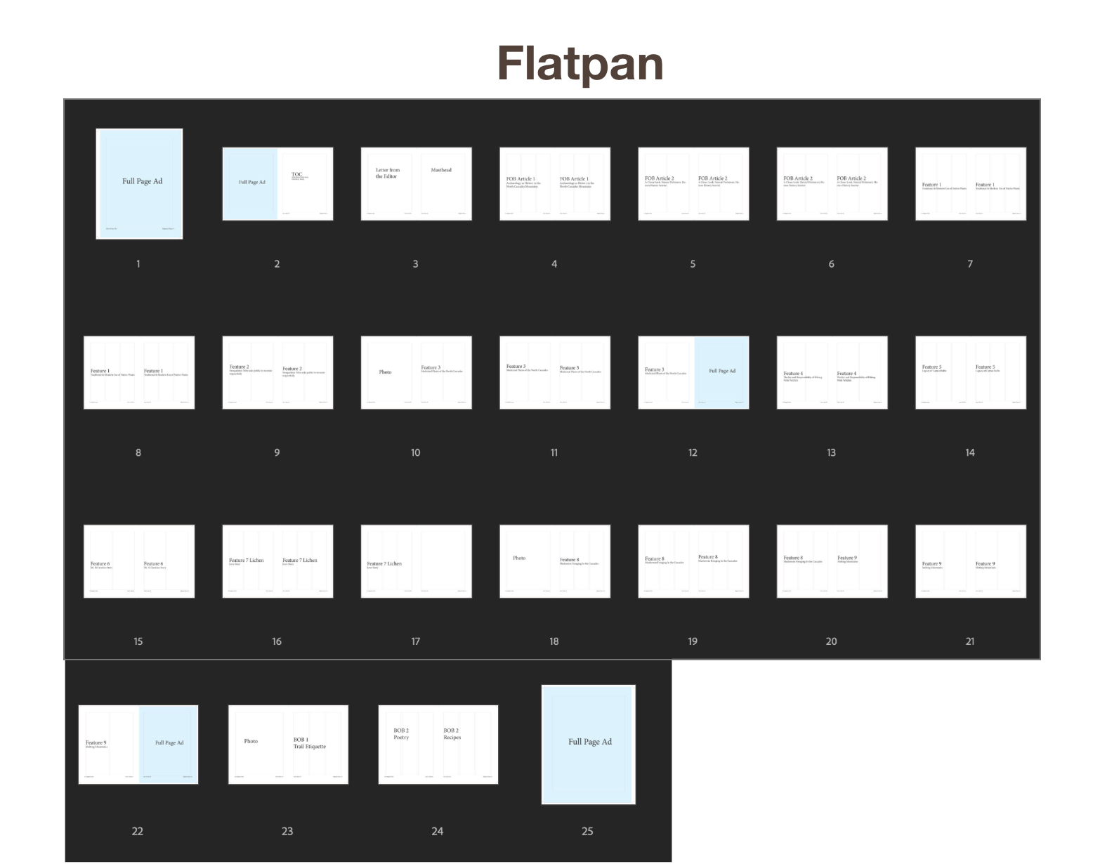
I then created a flatplan to organize the magazine’s content and establish a flow that felt natural and engaging for readers. This process helped determine which articles belonged in the front of the book, which features were best suited for the middle, and what content would appear in the back. The flatplan also allowed me to identify ideal placements for advertisements, ensuring they complemented the editorial content without disrupting the reader experience.
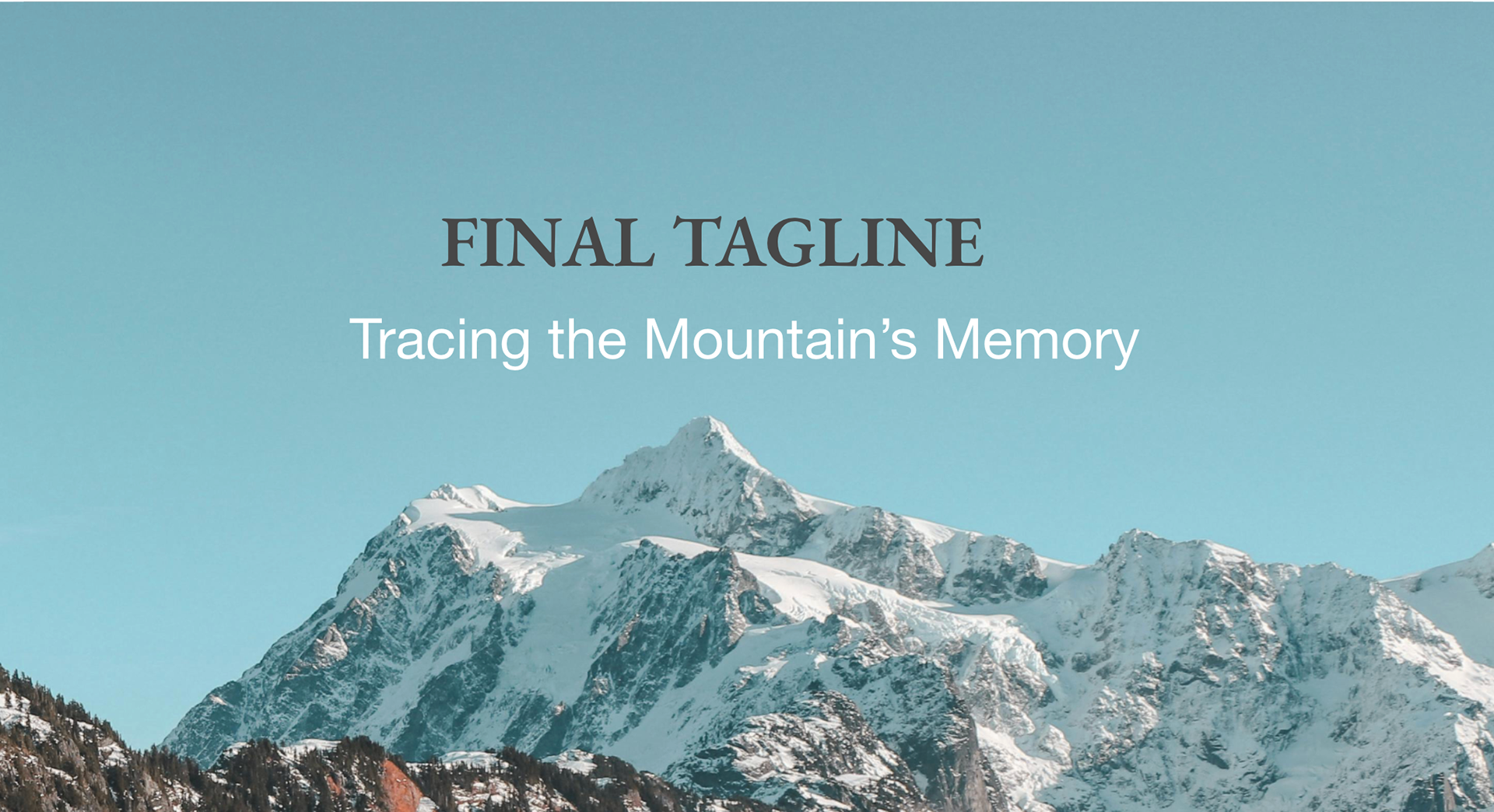
With the title of High Lore chosen, it was time to brainstorm a tagline.
The tagline Tracing the Mountain's Memory emerged from High Lore’s mission to uncover the stories, knowledge, and connections embedded within alpine landscapes. Mountains hold layers of ecological, cultural, and historical memory shaped by the plants, animals, waterways, and people that have interacted with them over time. The word tracing reflects the magazine’s approach to exploration and following these interconnected threads to reveal a deeper understanding of the land.
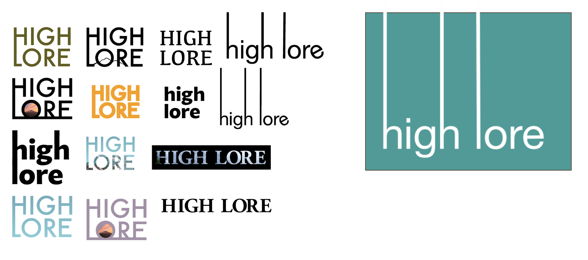
From a tagline and title comes an identity. One that needs a fitting logo.
The final logo for High Lore uses a restrained, lowercase wordmark anchored by tall vertical stems that extend through the composition. This creates a sense of elevation and structure, echoing the feeling of looking upward at mountain peaks. The simplicity of the typography allows the name to feel grounded and contemporary while still carrying a quiet sense of scale and openness.
I chose this direction because it reflects the magazine's core identity—minimal, spacious, and connected to the landscape. The extended vertical forms act as a visual metaphor for mountains and elevation, while the clean sans-serif type keeps it approachable and editorial.
For the body text in High Lore, I chose Garamond Pro Regular at 9pt with a leading of 11. After running many test prints, I chose it for its ease of reading, softness, and sophistication.
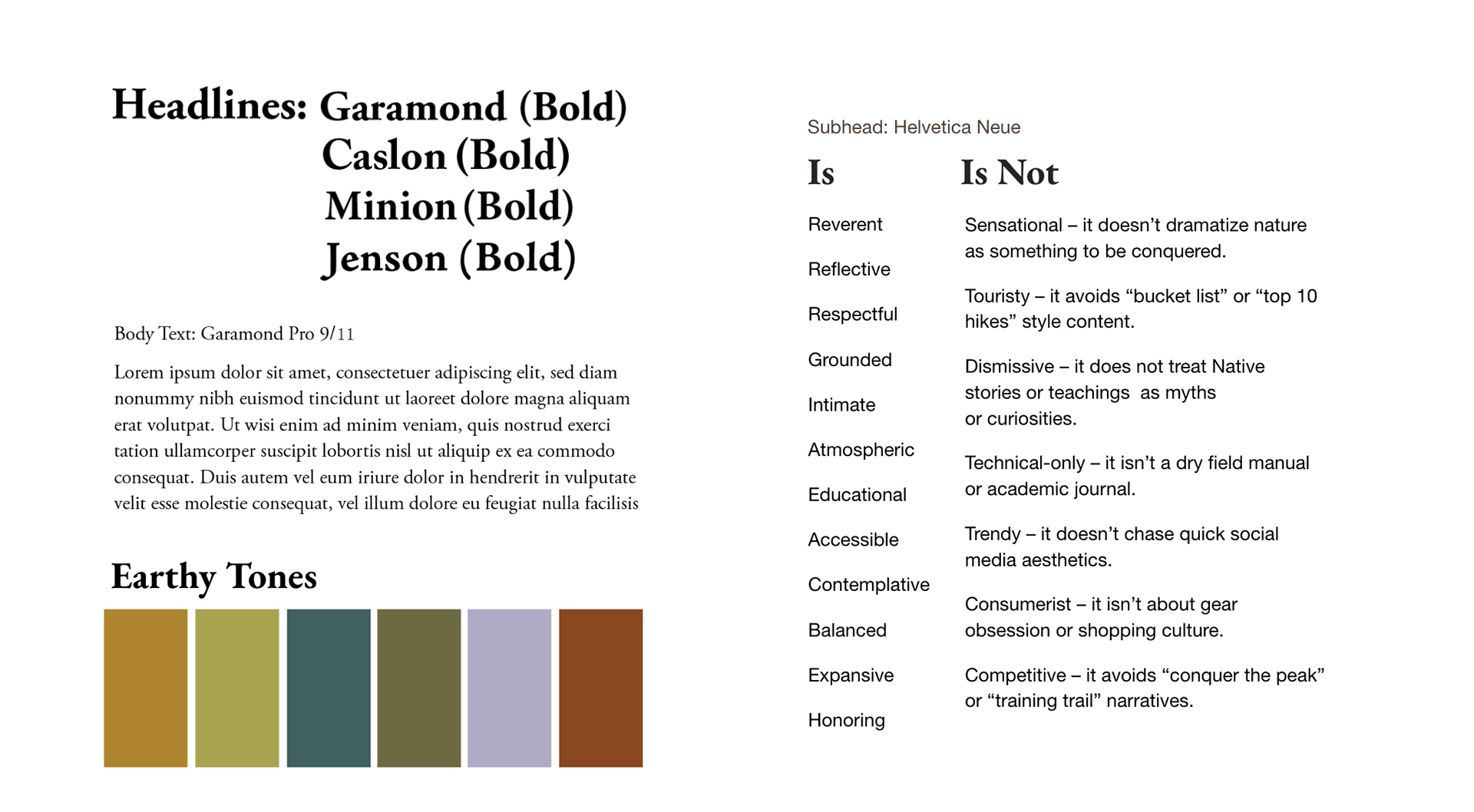
Within my chosen typefaces, I explored how hierarchy and expression could shift through pull quotes and paragraph headers. While maintaining a minimal approach for High Lore’s body text, I designed two simple paragraph header styles to preserve clarity and consistency across the publication.
Pull quotes were treated as moments of emphasis within the layout, designed to stand out subtly through variations in color and typographic treatment.
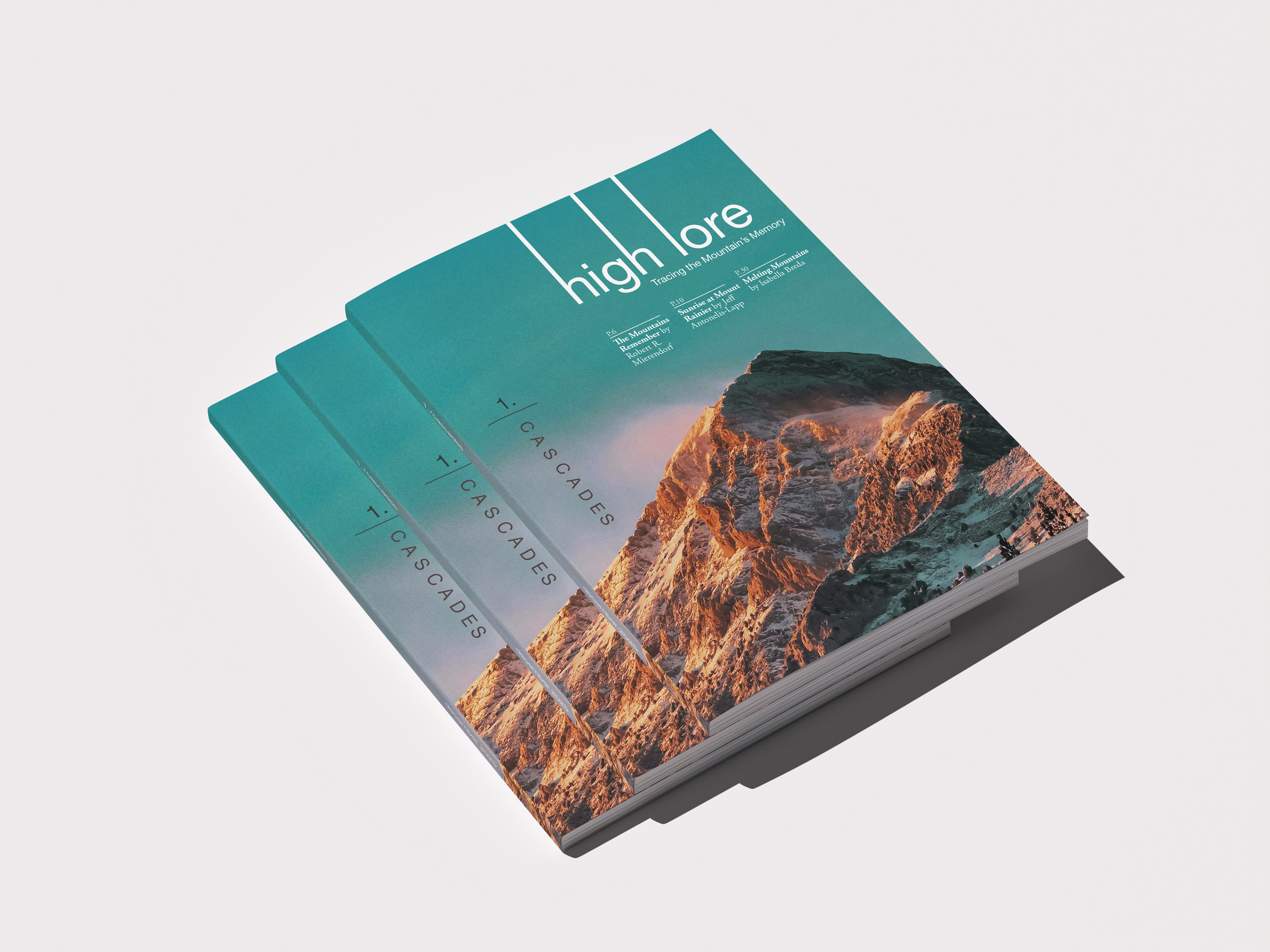
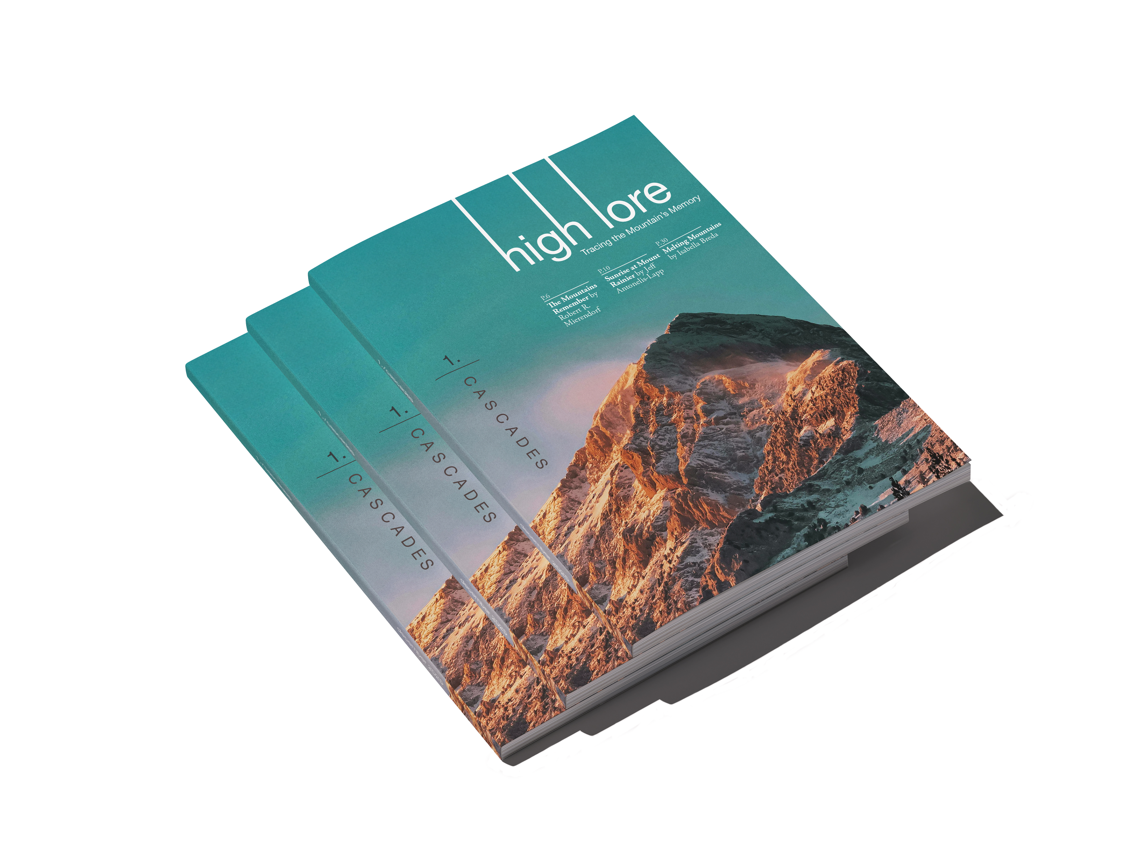
The cover balances structural typography, generous negative space, and a natural color palette to strike a tone that's quiet and expansive, yet still commands attention on a retail shelf. The masthead reads as modern and sturdy, echoing the verticality of the mountains themselves. A three-column editorial grid, paired with the vertically stacked, tightly tracked "1. / CASCADES" title, builds clear hierarchy and visual interest. Anchoring the rugged alpine peak in the lower half of the frame opens up breathing room above it, giving the cover a clean backdrop that holds onto that quiet tone of the magazine.